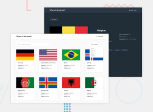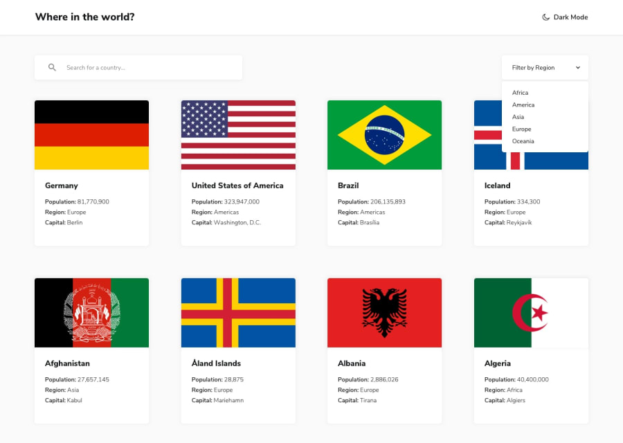
Design comparison
SolutionDesign
Solution retrospective
Learned a ton in this project with react-router, context, local storage, and mobile design. If you have any tips or best practices for me please let me know!
Community feedback
- @visualdennissPosted over 1 year ago
Your solution looks great as well as responsive! And functions well too. So congrats on completing the challenge succesfully.
One small suggestion related to a detail: Both of your modes, dark and light have the same icon of moon, i think it you have a sun icon for the light mode as moon is usually associated with dark mode. Other than that everything is top-notch!
Hope you find this feedback helpful!
1
Please log in to post a comment
Log in with GitHubJoin our Discord community
Join thousands of Frontend Mentor community members taking the challenges, sharing resources, helping each other, and chatting about all things front-end!
Join our Discord
