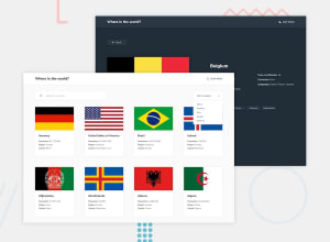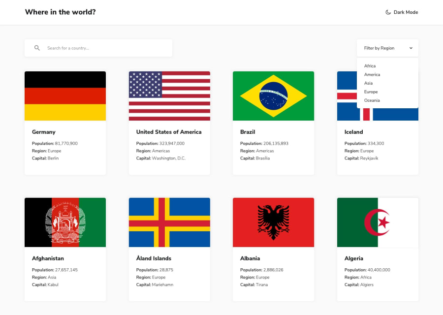
Design comparison
Community feedback
- @Mahmoud-ElagamyPosted 3 months ago
Great work! I encountered a few issues that could be improved:
1-The app seems to have difficulty retrieving data for countries. Instead of displaying the country information, it shows a 404 error page.
2-When searching for a country in a specific region (e.g., Egypt in Asia), the app should provide a clear message indicating that the country is not available in the selected region, rather than displaying the country.
3-Consider changing the color of the text input in dark mode for better visibility.
4-The light/dark theme button lacks visual feedback when hovered over. Adding a cursor pointer would enhance the user experience.
Good luck with the improvements!
0
Please log in to post a comment
Log in with GitHubJoin our Discord community
Join thousands of Frontend Mentor community members taking the challenges, sharing resources, helping each other, and chatting about all things front-end!
Join our Discord
