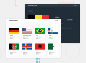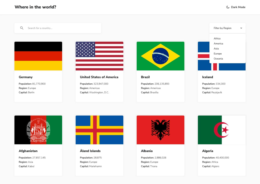
Design comparison
SolutionDesign
Solution retrospective
Please feel free to give me any feedback help me to improve my code ! . Thanks
Community feedback
- @makjnr317Posted about 3 years ago
Just a few tips for the inputs:
- For the <select> it is usually better to make it yourself using <div> it becomes easier to change its appearance with CSS.
- Use the the border property for the inputs
For other stuff:
- Make use of border-radius property
0 - Account deleted
Hi,
Your solution looks pretty ok, but the first thing I saw were those accessibility issues, they are a bit lot you should take care of there;
- The solution needs to be worked on more to be responsive because currently at about 1100px, the sections at the top go along with the screen but the countries aren't responding, and this goes on until 770px and it doesn't looks good.
- Also after switching to 2 columns this issue starts happening along the way.
- The images in the inside page are way too much and need to be sized appropriately.
- You should also add an option to return to showing all countries on the filter region, because once you start filtering you never go back.
0
Please log in to post a comment
Log in with GitHubJoin our Discord community
Join thousands of Frontend Mentor community members taking the challenges, sharing resources, helping each other, and chatting about all things front-end!
Join our Discord
