Design comparison
SolutionDesign
Community feedback
- @denieldenPosted almost 2 years ago
Hello Joseph, You have done a good work! 😁
Some little tips to improve your code:
- use
articletag instead of a simpledivto the container card for improve the Accessibility - fix the descriptive text in the
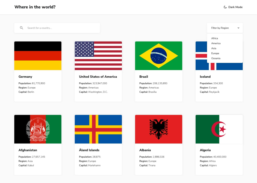
altattribute of the images now return [object Object] flag - remove all unnecessary code, the less you write the better as well as being clearer: for example the
divcontainer of image - use one class to
bodyto change the all theme color of app - after, add
transitionon the body to smooth the change theme color - use
ulelement for the details text of country instead of multiplediv - if you want to use the title for the
hrefattribute you have to parse it inurl, it can give problems creating links with empty spaces or special characters - if I type a query that doesn't give any results, nothing happens, try adding a "no results" message
- I would also add a query reset button, I find it very convenient
- to make all flag images the same height use the
object-fit: cover and aspect-ratio: 3/2properties
Keep learning how to code with your amazing solutions to challenges.
Hope this help 😉 and Happy coding!
Marked as helpful1 - use
Please log in to post a comment
Log in with GitHubJoin our Discord community
Join thousands of Frontend Mentor community members taking the challenges, sharing resources, helping each other, and chatting about all things front-end!
Join our Discord
