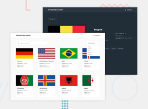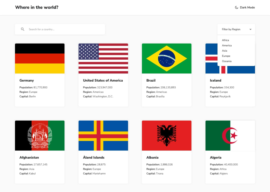
Design comparison
Solution retrospective
feel free to comment about what should i improve in the code!
Community feedback
- @IkuewumiPosted 12 months ago
Sorry, I didn't see this before, but I noticed you used predefined heights on the cards, it leads to the UK cark breaking, please try to avoid setting heights in general, they're kinda evil, and I think the cards would work even without a set height in this case
Marked as helpful0 - @IkuewumiPosted 12 months ago
Hi Ivan! Great project, I did notice somethings though:
-
The link on each country exists on only the image. This is maybe just my preference, but I think people might have problems finding that link as they would most likely just check the countries' name first, but this is just my experience, so take it with a grain of salt
-
More worryingly, the search functionality seems to have a bug, where it searches the input as it was before a change(eg. Searching for "a" when the user has typed in "ar"). I checked the code and there you used an onChange event(which should work, but for some reason doesn't), maybe look into the onInput event instead? Seems to work for this exact use case
Anyhow, this is a good project. Well done and happy coding, Ayobami
Marked as helpful0@ivanarajicPosted 12 months ago@Ikuewumi hey thanks for the feedback I appreciate it. I will definitely check for that bug in the search component. Thanks for the other suggestions.
0 -
Please log in to post a comment
Log in with GitHubJoin our Discord community
Join thousands of Frontend Mentor community members taking the challenges, sharing resources, helping each other, and chatting about all things front-end!
Join our Discord
