Design comparison
SolutionDesign
Community feedback
- @denieldenPosted over 2 years ago
Hey Imad, congratulations on completing the challenge 😉
Let me give you some little tips for optimizing your code:
- add
headertag and wrap thenavto improve the Accessibility - use
articletag for the container of cards instead ofdivto improve the Accessibility - remove all unnecessary code, the less you write the better as well as being clearer: for example the
divcontainer of images of flags - remove all
marginfrom.countryclass because with flex they are superfluous... usinggapproperty of flexbox to separate the cards - add
transitionon the body to have nice chango of dark mode - add
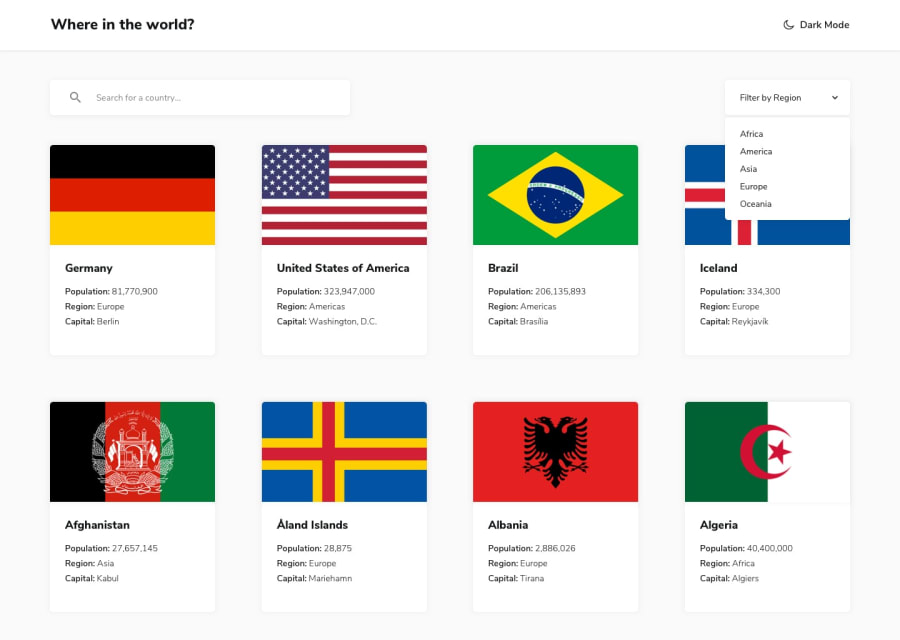
backgroundon the#user-actions .select-box .optionsclass otherwise the filter menu isen't leggible - instead of using
pxuse relative units of measurement likerem-> read here - if you want to use the title for the
hrefattribute you have to parse it inurl, it can give problems creating links with empty spaces or special characters - I would also add a query reset button, I find it very convenient
- in the filters there is no way to return to all countries after choosing a region, add an entry "all region"
Hope this help! Happy coding 😁
3 - add
Please log in to post a comment
Log in with GitHubJoin our Discord community
Join thousands of Frontend Mentor community members taking the challenges, sharing resources, helping each other, and chatting about all things front-end!
Join our Discord
