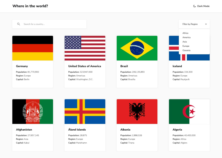
Design comparison
SolutionDesign
Solution retrospective
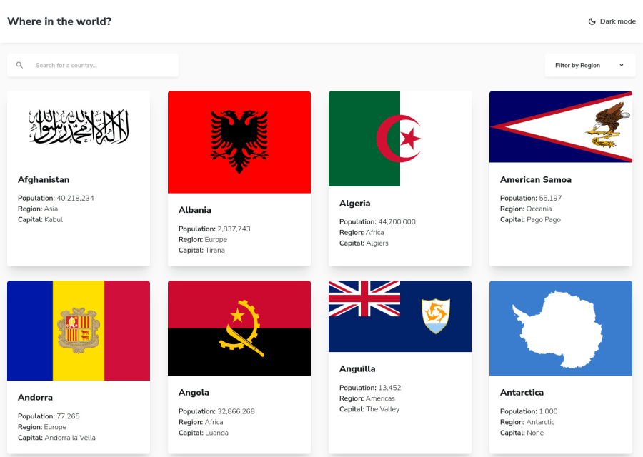
This was a fun project. This was my first time implementing dark mode, a dropdown menu and fuzzy searching. Svelte was a breeze to work with. Any feedback or suggestions for improvement are welcome :)
Community feedback
- @capitolcomputersPosted almost 2 years ago
Hey Man. This looks great. The padding on the left is not that visible.
Can you add up a little padding on the left when it's on desktop.
My pc is a 15.6 inches.
Other than that, It's a very beautiful job. And the code looks great.
0
Please log in to post a comment
Log in with GitHubJoin our Discord community
Join thousands of Frontend Mentor community members taking the challenges, sharing resources, helping each other, and chatting about all things front-end!
Join our Discord
