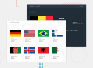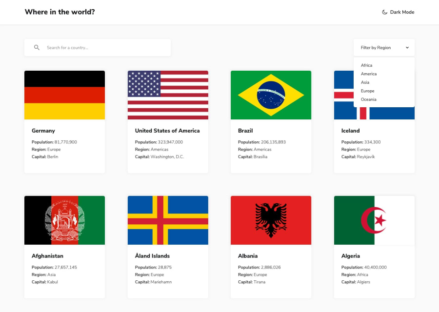
Design comparison
SolutionDesign
Solution retrospective
Any code review or comments, suggestions or critical criticism are welcome
Community feedback
- @better5afePosted about 1 year ago
Hi Hassan, nice project!
Here are some minor issues that I have observed:
- There are vertical and horizontal scrollbars on the Filter by region dropdown and they cover the select options.
- If the user hovers on the country card while the Filter by region dropdown is open, it is covered by the card.
- For better UX, the Back button should take the user back to the main page. Also, the Where in the world logo can be a link that takes the user back to the main page.
- You can change the input's background color to match the dark mode better.
- You can limit the text width as it overflows for some countries (see Republic of Zimbabwe page).
That's all I've found when it comes to the page functionality and user experience. Overall, the code is nicely written and the project structure well organised.
Happy Coding!
Marked as helpful1@HassanMak29Posted about 1 year agoThank you very much for your review @better5afe your suggestions have been implemented, thank you again!
1
Please log in to post a comment
Log in with GitHubJoin our Discord community
Join thousands of Frontend Mentor community members taking the challenges, sharing resources, helping each other, and chatting about all things front-end!
Join our Discord
