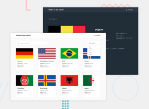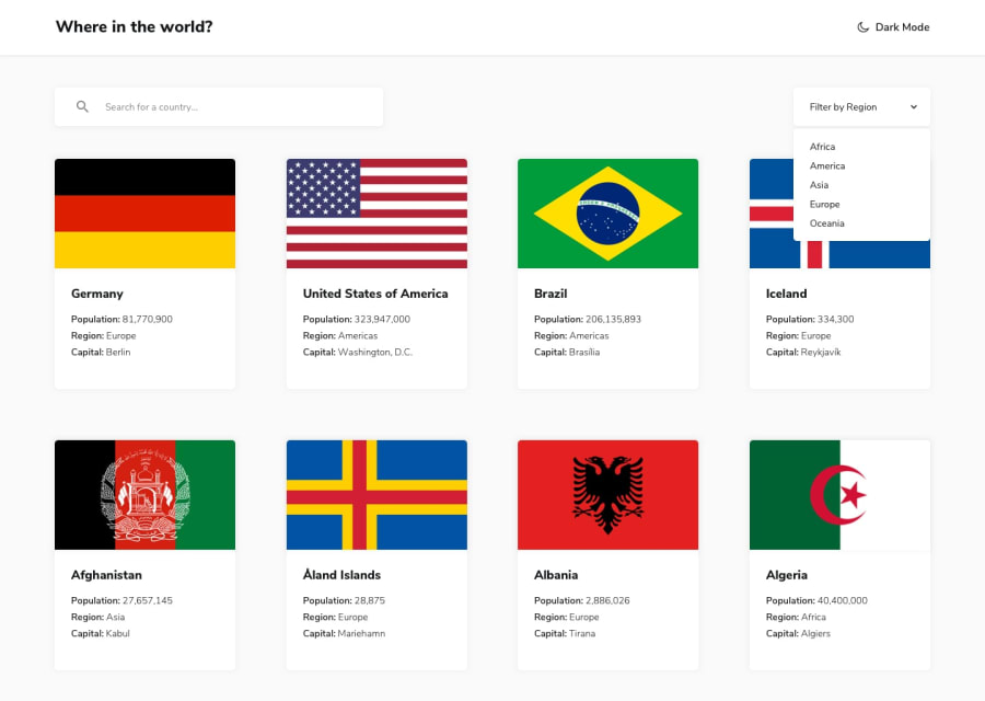
Design comparison
Solution retrospective
My first submission here. Kindly review and give your feedback(s). Thank you
Community feedback
- @shubhamthedevPosted over 4 years ago
Hi, the solution looks great and i love the theme switcher especially, here is a few things you can tweak:
-
The region filter doesn't let me switch back to viewing all countries, maybe add an option for that.
-
If i click on the border for a given country then their is no way for me to see go back an see all countries since it only shows me the country that i clicked on.
-
When clicking on the borders the page should automatically show me it's details.
-
When i click on a random country in the beginning and start scrolling on the details page i can see the main page scrolling for some reason.
These are the things that i noticed while looking at the site, I did this same solution a while back you can checkout my solution here.
Hope this helps.
2@tamsayPosted over 4 years ago@tomboynotes
I really appreciate your review and I've worked on all your recommendation. You can preview the new changes made on the site. Thanks a million
1@shubhamthedevPosted over 4 years ago@tamsay nice job it seems like you fixed most of the bugs, keep working hard on your skills and keep coding 👨💻
1 -
Please log in to post a comment
Log in with GitHubJoin our Discord community
Join thousands of Frontend Mentor community members taking the challenges, sharing resources, helping each other, and chatting about all things front-end!
Join our Discord
