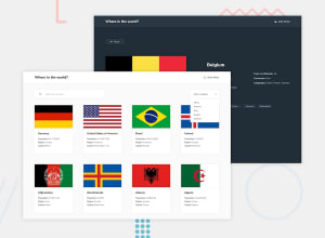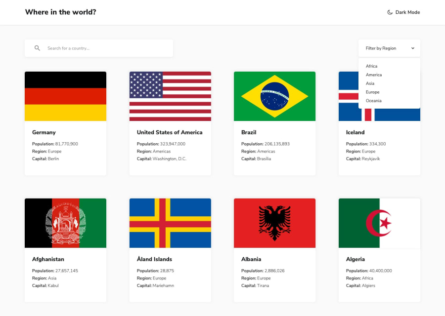
Design comparison
Solution retrospective
I'm most proud of successfully implementing features like fetching data from the API and displaying it in the UI, along with functionalities such as theme toggling, filtering, searching, and pagination. These aspects demonstrate my ability to handle complex tasks within the project. For the next iteration, I would explore different tech stacks like Next.js to broaden my skill set and gain insights into alternative approaches to solving similar problems.
What challenges did you encounter, and how did you overcome them?One of the main challenges I faced was integrating the search and filter functionalities seamlessly. Ensuring that they worked together without interfering with each other required careful management of state and logic. To overcome this, I meticulously structured my code, ensuring clear separation of concerns and implementing robust error handling. Through iterative testing and debugging, I was able to resolve the issues and achieve the desired functionality.
What specific areas of your project would you like help with?While I've successfully implemented the core functionalities of the project, I would appreciate guidance on optimizing performance and adhering to best practices, particularly in terms of code structure and organization. Additionally, feedback on design and user experience aspects would be valuable for further refinement of the project.
Community feedback
- @sksksk2024Posted 3 months ago
Hellow, @manishtmtmt !! 👋👋
All you've done with the interactions, looking and functionality of the site is great. Also, your code is not that long and It can be readable, even though you didn't separate the content in more separate files. 🌟
Some mentions to make your project more complete is to add a path for the singular country, so that if you click at one of them, just that country to pop up in the page(as the design from this challange looks). And work more in the user readability: for me(personally) I don't like to see the "Search" word appear above the placeholder "Search for a country..." or "Filter by region" and below the name of the region(and the fonts too in these cases, make them bold and bigger)! 📝
Hope It help and keep it up( with the tutorials too ;) )!! 🔥🔥🔥
0
Please log in to post a comment
Log in with GitHubJoin our Discord community
Join thousands of Frontend Mentor community members taking the challenges, sharing resources, helping each other, and chatting about all things front-end!
Join our Discord
