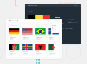
Rest countries api with theme switcher
Design comparison
Solution retrospective
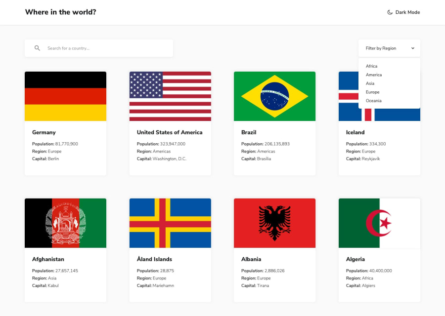
Loved that project. I preferred using the rest api instead the static file. I have used Redux for state management and RTK Query for fetching and caching also made use of the loader from react-router. I also decided to make the theme switching by using daisy-ui and tailwind-css. For styling I used tailwind-css. Tried to cover the 404 response in an Error page. Polished a bit with framer for some minimal animations.
Community feedback
- @EdouardHrgtPosted about 1 year ago
Nicely done ! I got a little layout issue : When searching for a specific country, your background color doesnt fill the entire viewport height as your grid is on only 1 row. I recommand adding a
min-height: 100dvh;to your grid container to avoid this !2 - @ElHuzainPosted about 1 year ago
Hey, I have a suggestion, I think it'd be nicer to make the "Dark Mode" text clickable, not just the icon. Even better, make it say "light mode" when it's dark. And "dark mode" when it's light.
Good luck!
1
Please log in to post a comment
Log in with GitHubJoin our Discord community
Join thousands of Frontend Mentor community members taking the challenges, sharing resources, helping each other, and chatting about all things front-end!
Join our Discord
