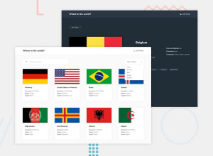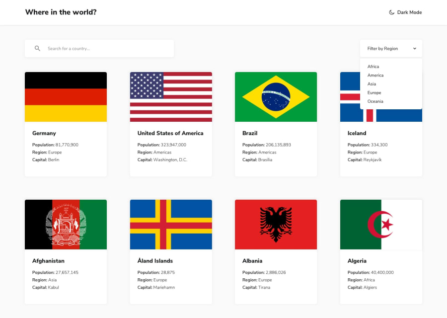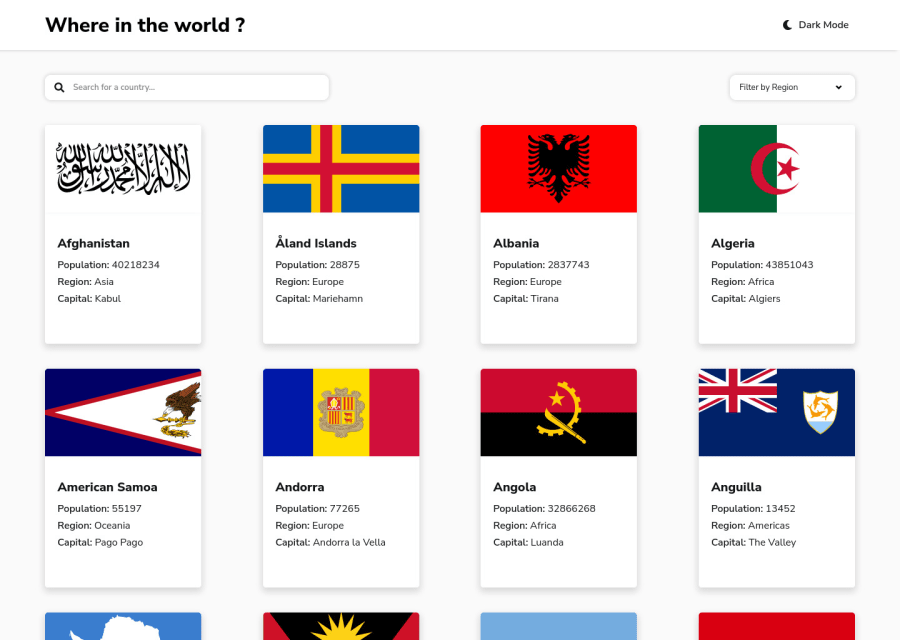
Design comparison
Solution retrospective
Hello ,
this website was made with react and sass . :)
Community feedback
- @joejcoxPosted almost 3 years ago
Looking good but I would work on the routes.
When you visit a country the pathname is just /country. It would be good if the user could load this page initially and view the content. Instead, on refresh or first load at this path you get a 404 error as either the app doesn't know what country to load as no default is given because everything is client side. There are ways around it but you'd need to at least update the pathname to display the individual country name or code.
The other thing with the way the data is displayed on the /country route is that you can't use the browser's built in back functionality to go back to the last country you were viewing. The user can click the border option but it is always a good idea to use browser history in my opinion.
I would recommend looking in to NextJS if you haven't already, it's really straightforward and if you can use React then you'll learn Next in no time via their docs https://nextjs.org/docs/getting-started
Marked as helpful0 - @optimusprime202Posted almost 3 years ago
Hey @khersinpro, Couldn’t have done it better myself.
Marked as helpful0 - Account deleted
Hi there 👋
Congratulate on finishing your project 🎉. You did a great job 💡
I give some suggestions to help you take your project design to the next level 📈😉
- Change the moon icon o the sun on the dark mode
- Maybe make the box-shadow a bit lighter ✅
Happy coding ☕
Maqsud
Marked as helpful0 - @NaveenGumastePosted almost 3 years ago
Hay ! kevin Good Job on challenge
These below mentioned tricks will help you remove any Accessibility Issues
-> Add Main tag after body
<main class="container"></main>
-> Always use the "alt attribute" and write what img is , and if the img is for decorative then leave it empty but always add it with img tag.
-> Always use
h1
first and thenh2
,h3
and so on-> Learn more on accessibility issues
If this comment helps you then pls mark it as helpful!
Have a good day and keep coding 👍!
Marked as helpful0 - @denieldenPosted almost 3 years ago
Hi Kevin, I took some time to look at your solution and you did a great job!
Also I have some tips for improving your code:
- add
main
tag and wrap the card for Accessibility - on the homepage I suggest you to use css
grid
instead offlex
for the container of card... initially I also used flex but I noticed that it created some problems with the flag images - instead of using a
ul
use adiv
for card body... it isn't correct to wrap ali
with ana
tag - I suggest you to add an error message or "0 results" if typing in the search
input
doesn't have any returned results - in the details page there remains a hole on the right of large screen
Overall you did well :)
Hope this help and happy coding!
Marked as helpful0 - add
- @khersinproPosted almost 3 years ago
Hi Deniel ,
Thanks for your advice, it will help me a lot.
1
Please log in to post a comment
Log in with GitHubJoin our Discord community
Join thousands of Frontend Mentor community members taking the challenges, sharing resources, helping each other, and chatting about all things front-end!
Join our Discord