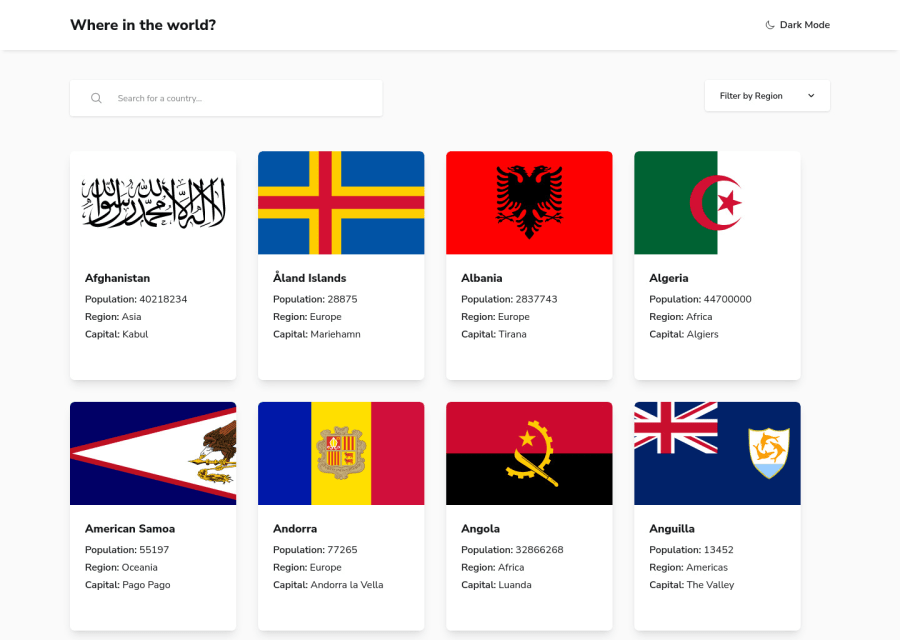
Rest Countries Api with React Typescript Tailwindcss Vite js
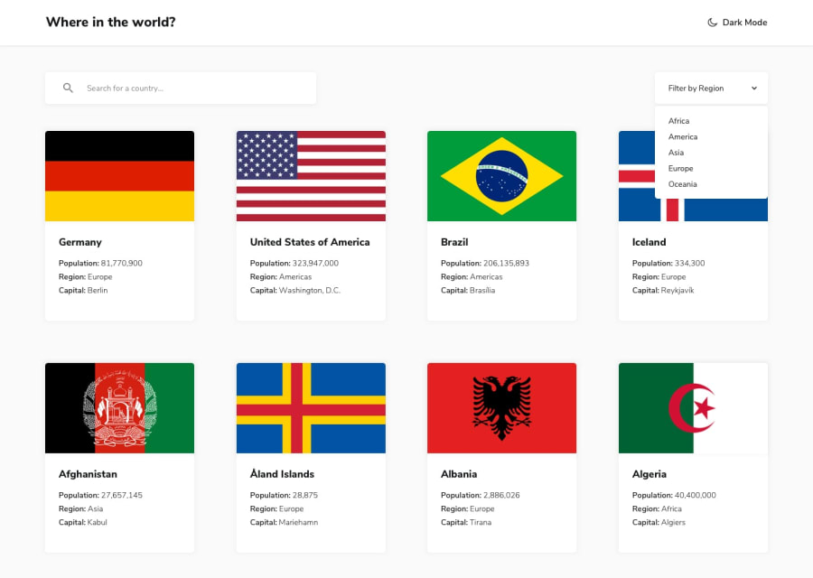
Design comparison
Solution retrospective
Feedback is welcome.
Community feedback
- @denieldenPosted about 2 years ago
Hi Jesse, congratulations on completing the challenge, great job! 😁
Some little tips for optimizing your code:
- add
headertag and wrap the navbar to improve the Accessibility - add
maintag and wrap the content of page (all cards) to improve the Accessibility - also you can use
articletag inside theatag to the container card for improve the Accessibility - add
transitionon the element with change theme color - instead of using
pxuse relative units of measurement likerem-> read here - use
ulelement for the details text of country instead of multiplep - if I type a query that doesn't give any results, nothing happens, try adding a "no results" message
- I would also add a query reset button, I find it very convenient
- in the filters there is no way to return to all countries after choosing a region, add an entry "all region"
Hope this help! Happy coding 😉
Marked as helpful1@J-e-s-sePosted about 2 years ago@denielden Thanks for the positive criticism. I've worked on most of the tips.
1 - add
- @AliMuhammadOfficialPosted about 2 years ago
Overall it looks good but needs some improvements. when we have applied the filter for the region and click somewhere else on the page filter dropdown should get closed. the second problem is with accessibility when we press the tab it doesn't take us to the filter dropdown! after the search box, it goes directly to the country's cards. The search box and filter dropdown's heights don't match they both should have the same height. in my opinion, it'll look good if cards are in the center of the page. and should have less margin on xs and sm screens.
Marked as helpful0@J-e-s-sePosted about 2 years ago@AliMuhammadOfficial Thanks for informing me on the faults of my solution.
I've improved the "region" filter. It closes when I click somewhere else on the page and it is also accessible by pressing the tab key.
I also reduced the margins on smaller screens.
The filter dropdown matches its design file equivalent.
0
Please log in to post a comment
Log in with GitHubJoin our Discord community
Join thousands of Frontend Mentor community members taking the challenges, sharing resources, helping each other, and chatting about all things front-end!
Join our Discord
