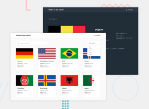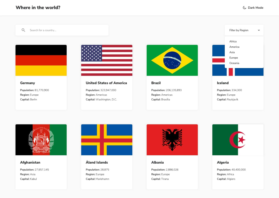
Design comparison
Community feedback
- @piyush4Posted almost 3 years ago
Hi, good job with the website.
A few suggestions:
1.) The design of the details page for the country can be improved for the mobile version
2.) You can use the Context API in react to implement the dark mode functionality.
0@Kyle-AtienzaPosted almost 3 years ago@piyush4 thankyou for the suggestions, I didn't really focus much on the aesthetic and just wanted to have the website to be able to work (even though the code needs more improvement too). I will consider your suggestions for my next projects
0 - @anoshaahmedPosted almost 3 years ago
To avoid accessibility issues in the future:
- wrap everything in your body in
<main>OR giverole=""to the direct children of your<body>... Click here to read more - start your headings with
<h1>and move up by one level each time
Good job! :)
0@Kyle-AtienzaPosted almost 3 years ago@anoshaahmed hi thankyou for your feedback I will consider this for me next react project
1 - wrap everything in your body in
Please log in to post a comment
Log in with GitHubJoin our Discord community
Join thousands of Frontend Mentor community members taking the challenges, sharing resources, helping each other, and chatting about all things front-end!
Join our Discord
