Rest Countries App (React/TS/Tailwind)
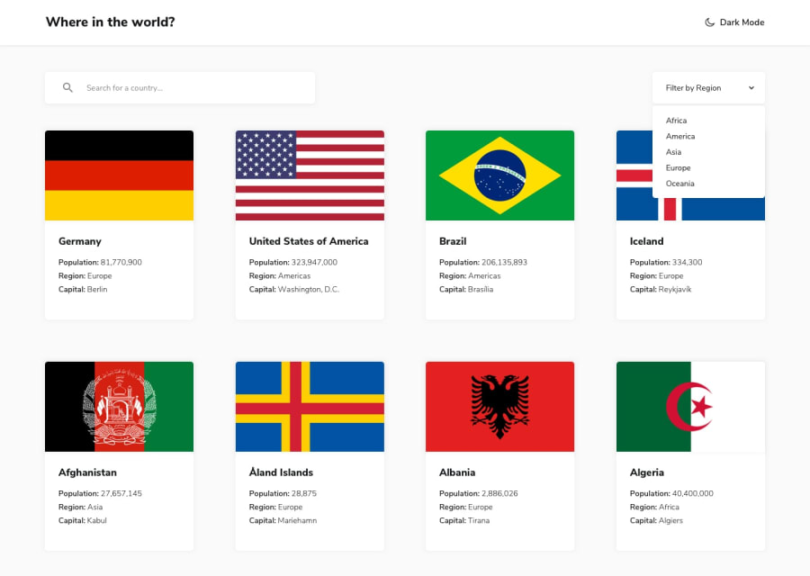
Design comparison
Solution retrospective
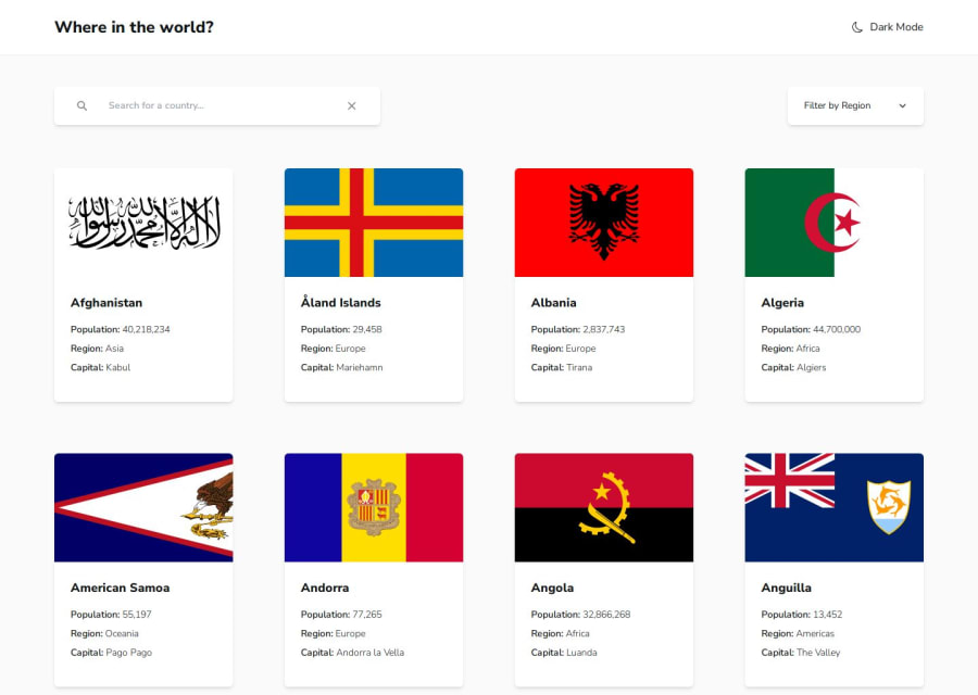
To make it more real-world I implemented React Query to fetch the data using real API endopoints and search debouncing.
Community feedback
- P@michael-schlueterPosted 5 months ago
Hey there,
this is impressive, inspiring work. There's a lot to like looking at your project. First of all the structure is very clean. That makes it easy to comprehend what's going on in your code. Kudos to that.
In general the project works as expected and looks and behaves beautifully. I like the small animations you've added which make the site feel quite lively. Also providing loading spinners and error pages makes for a great user experience.
There's just a couple of small things I picked up. On the homepage you formatted the population number for the countries but you forgot to do so on the Country Details page. Also I would think about extending the clickable area for activating light/dark mode to the light/dark mode text next to it. I think most users expect that text to be also clickable instead of just the moon icon.
All in all great work. Keep it up!
Marked as helpful1@bartoszdudziak-devPosted 5 months agoThanks for the comment! It is very helpful.
I will improve my solution using your tips soon! 😁
0
Please log in to post a comment
Log in with GitHubJoin our Discord community
Join thousands of Frontend Mentor community members taking the challenges, sharing resources, helping each other, and chatting about all things front-end!
Join our Discord
