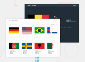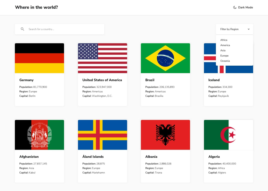
Design comparison
Solution retrospective
Using an actual javascript framework like next.js was actually really fun and a lot easier than i had initially expected it to me, the only problem i encountered during this challenge was deploying it on github. I still need to add a few things i missed and am definitely planning to add them later.
Community feedback
- @C3SC0-V4113Posted 7 months ago
Hi! Im seeing some errors in the solution, in mobile the inputs overflow an break the design, you can fix it using flex and media queries to adjust their width when the screen is smaller, also im seeing that you can only filter using or the select input or the text input, and not both of them, you could filter the countries using the filter method of javascript in the future, this can also help you to filter countries when nos typing exactly how the country is named. Overall good project! Nice for your first NextJS Project
extra: You could add parameters to the url to mantain the state of the search :)
Marked as helpful0@vedjain773Posted 7 months ago@C3SC0-V4113
thanks for the feedback! I definitely glanced over some important stuff in my solution to the challenge and ma looking forward to fixing issues you have commented on, will definitely work on media queries when I come back to this project
0
Please log in to post a comment
Log in with GitHubJoin our Discord community
Join thousands of Frontend Mentor community members taking the challenges, sharing resources, helping each other, and chatting about all things front-end!
Join our Discord
