Submitted over 2 years ago
rest countries api with nextJs and tailwind-css
@bhonePyae99
Design comparison
SolutionDesign
Community feedback
- @zineb-BouPosted over 2 years ago
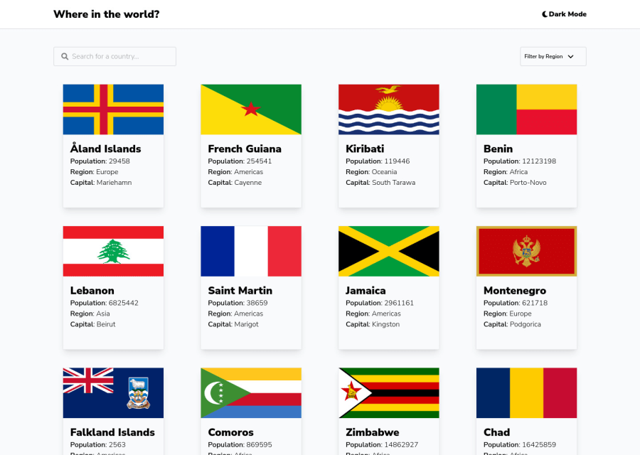
Hi there, Good job on this challenge, your solution is nicely responsive, though there are some cards that have different sizes compared to the others on mobile screens.
Here are comments about semantics and accessibility
- There are two
<h2>here, the title“where in the world”and“dark mode”the theme button, first of all, button text shouldn’t be a title, in this case, it is better to use<h1> where in the world</h1>since it is a single-page website. - When it comes to interactive elements, instead of using
<div>for the theme button use a<button>. - Add an
alttext to the flag images since it is an informative image. - Screens between (750px and 480px), when clicking on the arrow toggle to filter by region, the options list float to the left instead of sitting under
“fitter by region”. - The cards are clickable elements, but you haven’t provided anything such as an anchor tag or a button that suppose to do that, I recommend reading about accessible cards.
Happy coding
Marked as helpful1 - There are two
Please log in to post a comment
Log in with GitHubJoin our Discord community
Join thousands of Frontend Mentor community members taking the challenges, sharing resources, helping each other, and chatting about all things front-end!
Join our Discord
