Rest Countries API with Dark Mode switcher, React
Design comparison
Solution retrospective
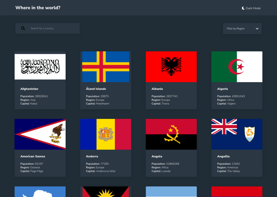
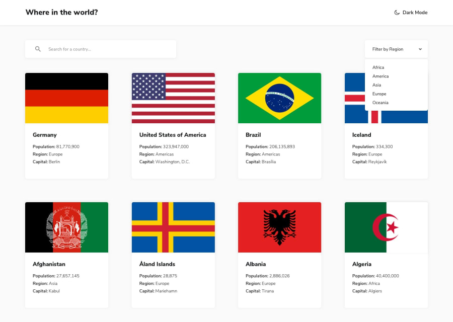
Hey guys, this project took me a while to finish. The design isn't exactly like the template, but to be honest, I don't think it's so important to be. I would appreciate any feedbacks. Thanks.
Community feedback
- @nkhatri7Posted almost 3 years ago
Hey well done on completing this challenge! The overall functionality seems to be pretty good. The only thing I'd suggest is adding hover states for the border countries buttons and the back button on the details page. Also if you want to make the flags look better on the cards, I'd suggest using
object-fit: coverand making them all the same height and width so there's a consistent look. Other than that the design and code look great!Marked as helpful1
Please log in to post a comment
Log in with GitHubJoin our Discord community
Join thousands of Frontend Mentor community members taking the challenges, sharing resources, helping each other, and chatting about all things front-end!
Join our Discord
