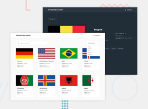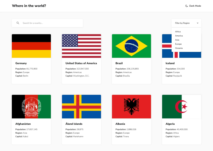
rest countries api with color theme switcher with react JS
Design comparison
Community feedback
- @admasePosted about 1 year ago
Hi, I recommend a container within the class name 'country' or outside to center the country flag and details instead of the big gap in between the contents, also increase the width and height of the flag there's is plenty of space to fill in. I would suggest filtering the regions in ascending order when a user selects an option. Lastly, have a footer with copyright, license, and a link to your Github page for people who find interest in your work. Include comments in your code. Overall very nice work, about 4 to 5 pages of code, if I was to utilize ReactJS I would've created a component for each piece of data fetched from the API. Thanks for sharing.
Marked as helpful0@mohamadc21Posted about 1 year agoThank you very much for telling me my mistakes. I have been learning react for 1 month now, and with these projects, react is more attractive to me than the game. Thank you for your advice. @admase
0
Please log in to post a comment
Log in with GitHubJoin our Discord community
Join thousands of Frontend Mentor community members taking the challenges, sharing resources, helping each other, and chatting about all things front-end!
Join our Discord
