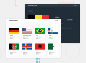
REST Countries API with color theme switcher with React
Design comparison
Solution retrospective
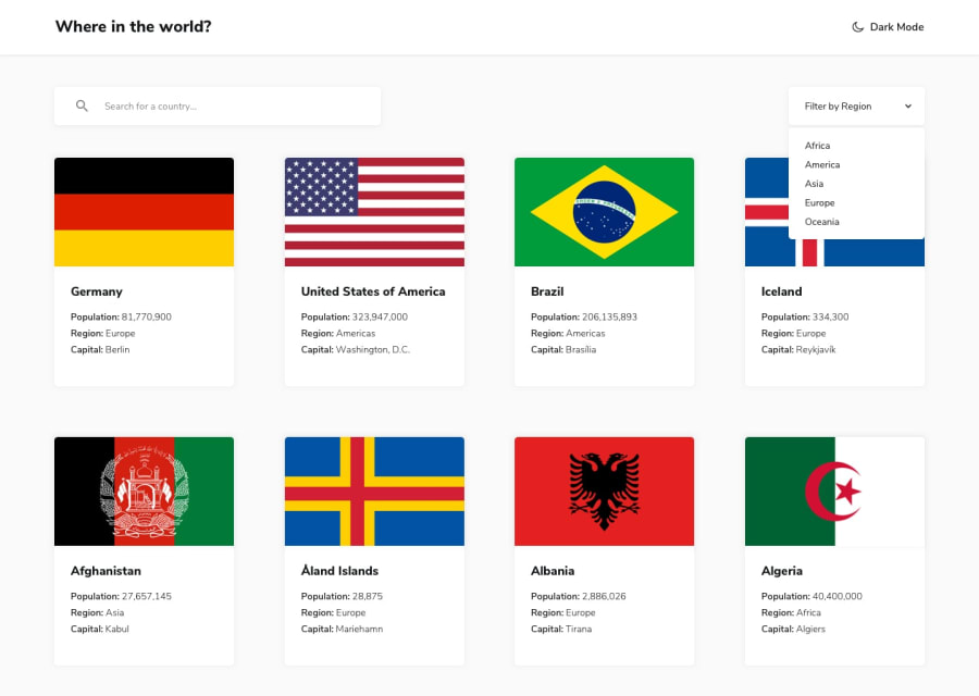
This was a fun challenge for me. The api isn't very complicated but I learned a few things on how to target values that were nested inside the json objects. Sometimes it's not that intuitive so that was nice thing to add to my toolbox. Also figuring out how to deal with two simultaneous filters and get the correct result was interesting. I also employed an npm package called react-select. This is a package for a dropdown that was a little problematic to figure out the styling, but once I learned the syntax and how to target the properties I wanted to change, it was worth it. This package also works well if you need multi-value selection capabilities. Check it out and leave some feedback please.
Community feedback
- @denieldenPosted over 2 years ago
Hi JD, congratulations on completing the challenge, great job! 😁
It is normal that it is complicated at first but do not worry with the practice you will see that everything will be simpler and more intuitive :) do not give up!
Some little tips for optimizing your code:
- add
headertag and wrap the navabr for improve the Accessibility - use
maintag to wrap the content of page and for improve the Accessibility - also you can use
articletag instead of a simpledivto the container card for improve the Accessibility - remove all unnecessary code, the less you write the better as well as being clearer: for example the
divcontainer of image - use
ulelement for the details text of country instead of multiplep - if you want to use the title for the
hrefattribute you have to parse it inurl, it can give problems creating links with empty spaces or special characters - if I type a query that doesn't give any results, nothing happens, try adding a "no results" message
- I would also add a query reset button, I find it very convenient
Hope this help! Happy coding 😉
Marked as helpful0@PeshwariNaanPosted over 2 years ago@denielden Thank you so much for taking the time to review my project. I'm still getting familiar with the accessibility aspects in my code so I appreciate the advice and will change the code accordingly. I had meant to put in a query reset button and then spaced it out, I definitely need to include one. I haven't had too much experience with themes and I know I have a lot of redundant code for the dark theme switch. I went through all of your code and was able to understand how you approach it and it's great and so much cleaner than my approach. I will definitely apply those principals in my next project. I see a lot of messy coding in some solutions on here so being able to see some examples with some professional coding practices is very refreshing. Definitely a huge help on a lot of levels. p.s - Your Rick and Morty page is awesome. Cheers.
1@denieldenPosted over 2 years ago@PeshwariNaan You are welcome and Thank you so much :) Keep it up JD :)
0 - add
Please log in to post a comment
Log in with GitHubJoin our Discord community
Join thousands of Frontend Mentor community members taking the challenges, sharing resources, helping each other, and chatting about all things front-end!
Join our Discord
