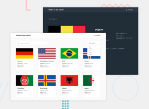
Design comparison
Solution retrospective
Country Data API - Frontend Mentor Challenge
This project is a solution to the Frontend Mentor challenge that involves displaying data from a country API. It was built using React, Tailwind CSS, and React Router to create a fully responsive and interactive front-end application.
Technologies Used
- React: A JavaScript library for building user interfaces.
- Tailwind CSS: A utility-first CSS framework for rapid UI development.
- React Router: A library for routing in React applications.
- RESTful API: Fetching data from a public API to display information about countries.
Features
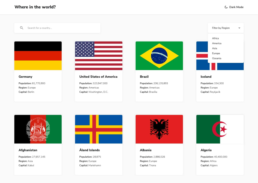
- Country List: Displays a list of countries with details like name, population, region, and capital.
- Search Functionality: Allows users to search for countries by name.
- Filters: Filter countries by region (e.g., Africa, Americas, Europe, etc.).
- Country Details Page: When a user clicks on a country, they are taken to a page with more detailed information about that country, including languages, currencies, and borders.
Community feedback
- @Mahmoud-ElagamyPosted 13 days ago
Firstly, I want to commend you for creating a functional and clean app with a user-friendly interface—great work! I really enjoyed navigating through it and exploring the countries’ details. To make this impressive app even better, I have a few suggestions for improvement:
404 Error on Page Reload:
I noticed that reloading a country’s detail page results in a 404 error.
Active Region Styling in Light Mode:
The UI is polished and consistent, but I did observe that in light mode, the active region lacks distinct styling compared to dark mode.
User Feedback for Searches Across Regions:
When searching for a country that isn’t part of the currently active region (e.g., searching for a country in Africa while the Asia region is active), the results section appears blank. To enhance user experience, displaying a friendly message like “No results found in the selected region.
Overall, this app already stands out with its clean design and functionality. By addressing these enhancements, you can take it to the next level and offer an even more seamless experience for users. Keep up the great work—I look forward to seeing your app continue to evolve!
1 - @dylan-dot-cPosted 13 days ago
Well done the design(not looking like it was supposed to) is awesome! I actually like it, especially dark mode.
Only issue I see is that you should make the available border countries navigatable so when a user click on a border country they can go to that page.
Also seeing that you are using your own designs you can add a pagination feature that limits up to 20 countries per page.
Other than that you are good!
Also check out my solution and tell me what you think(I used react, tailwind and tanstack query)
1
Please log in to post a comment
Log in with GitHubJoin our Discord community
Join thousands of Frontend Mentor community members taking the challenges, sharing resources, helping each other, and chatting about all things front-end!
Join our Discord
