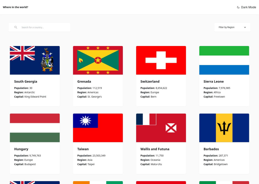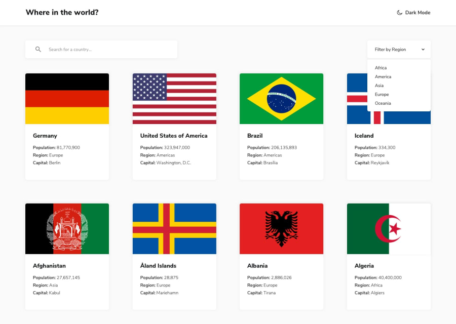
REST-Countries-API-with-color-theme-switcher-v2-Redux-Tailwind
Design comparison
Solution retrospective
I'm really proud of the progress I've made over the past eight months. Reflecting on where I started, it's amazing to see how much I've improved. This project showcases my growth and hard work. I'm excited to see where I'll be in another eight months!
For future updates, I plan to:
Play with Animations: Incorporate animations for cards and hover effects to enhance user interaction and visual appeal.
Refine Details: Focus on improving spacing, alignment, and overall visual consistency to create a more polished and cohesive user experience.
Optimize Data Fetching: Consider fetching all data once and then filtering it locally to reduce the number of API calls. I'm still exploring the best method for this approach and if it would be better.
What challenges did you encounter, and how did you overcome them?Honestly, the biggest challenge was trying to finish this over a weekend. Maybe the real challenge should be getting more sleep, but well, well. On the bright side, I significantly improved my grid skills with this project!
What specific areas of your project would you like help with?I'd love to hear your thoughts on:
Fetch and Search Functionality: Is fetching all data once and filtering locally a better approach, or should I stick with fetching data on demand?
Responsiveness: I chose a growing approach for responsiveness because it looked better than having a single item in the middle on small tablets. Do you think this approach works well, or do you have suggestions for improvement?
Your feedback will help me refine and improve the project. Thank you!
Community feedback
Please log in to post a comment
Log in with GitHubJoin our Discord community
Join thousands of Frontend Mentor community members taking the challenges, sharing resources, helping each other, and chatting about all things front-end!
Join our Discord
