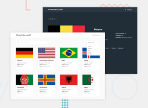
rest-countries-api-with-color-theme-switcher-using-react
Design comparison
Solution retrospective
okay
What challenges did you encounter, and how did you overcome them?okay
What specific areas of your project would you like help with?okay
Community feedback
- @TedJenklerPosted 3 months ago
Hi again @ARPIT73881,
Nice project! I really love the hover effects you've implemented. Here are a few small improvements you might consider:
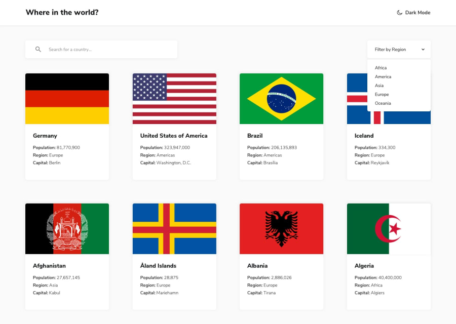
Custom Select Component: I recommend looking into how to create a custom select component, like a <div> dropdown menu. With a custom component, you can position the arrow correctly, add a transform: rotate(180deg) effect when the dropdown is active, and apply hover effects to the dropdown options. This would really enhance your project.
Card Borders: Consider adding a subtle border to your cards so that countries like Indonesia don’t blend into the background. This will help maintain visual clarity and make your content more readable.
Use of Hooks: Your use of React hooks and the overall structure of your React code looks really great—keep up the good work!
Axios and Async/Await: While your use of fetch and promises is perfectly fine, I would recommend trying out Axios for data fetching and using async/await instead of promises. These approaches are often considered more modern and can make your code cleaner and easier to read.
Hope these suggestions are helpful!
Best, Teodor
Marked as helpful1 - @ARPIT73881Posted 3 months ago
Thanks for giving the valuable feedback . I will try to work on them .
0
Please log in to post a comment
Log in with GitHubJoin our Discord community
Join thousands of Frontend Mentor community members taking the challenges, sharing resources, helping each other, and chatting about all things front-end!
Join our Discord
