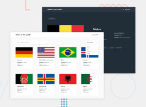
Responsive Countries Info Site Using REACTJS And REST COUNTRIES API
Design comparison
Solution retrospective
I did this project to practice REACT which i started learning recently so any feedback would be greatly appreciated.
Community feedback
- @PeshwariNaanPosted almost 2 years ago
Hello Kajetan - Nice job on completing the challenge - It looks great.
Here are a couple tips that might help:
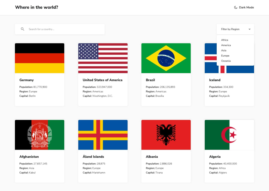
- The flag image in your card component is being cut off which you don't want. If you set a max width on the card main container like
max-width: 320pxand then apply
img {
     aspect-ratio: 3.3 / 2;
     object-fit: cover;
  }
for the image, it should fix that issue. I found a guy here on FEM that is great at keeping the css really simple and his design strategies are great to learn from. His name is Deniel Den and here is a LINK to his solution. I did mine a little differently if you want to check out my SOLUTION* here. You can also see how I did the media queries for the details page if you want to change your desktop view to match the design.
- To get rid of all the accessibility and html errors, simply add
alt={`flag of ${country.name.common}`}to your card img element. Your variable might be different so adjust accordingly.
I hope these couple things help you out - Happy coding.
Marked as helpful0 - The flag image in your card component is being cut off which you don't want. If you set a max width on the card main container like
Please log in to post a comment
Log in with GitHubJoin our Discord community
Join thousands of Frontend Mentor community members taking the challenges, sharing resources, helping each other, and chatting about all things front-end!
Join our Discord
