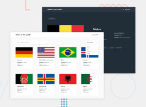
REST Countries API with color theme switcher solution
Design comparison
Solution retrospective
Dark mode: "Can you share best practices or recommended approaches for managing the theme in these projects?"
Perfect Pixel: "In your experience, how important is achieving pixel-perfect design in web development projects? Are there situations where it's acceptable to deviate from perfect pixel alignment, and if so, what factors contribute to those decisions?"
Component Organization: "When structuring and organizing components in a project, what strategies or best practices do you recommend? Are there specific patterns or architectural principles that can help maintain a clear and scalable component structure over time?"
Community feedback
- @alanb4rtPosted 3 months ago
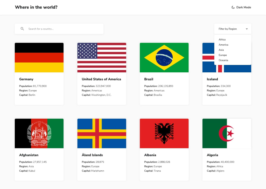
good job for the perfect pixel. Just check the space at the bottom of every card
Marked as helpful1 - @Yejin-HanPosted 3 months ago
You did a great job! I felt that the completeness was high because even the effects such as hover, which were not specified in the style guide were all implemented. As a person who is still studying, I can't answer the requirements you wrote above, but I will briefly tell you the problems I've found.
In a responsive design, elements touch the left and right ends at certain screen widths. It would be better if you could give a little margin around the contents. Also, the detail page doesn't bind the data to the Native name, and the text layout is sometimes broken. Furthermore, I think it would be good to separate the files for the main page and the detail page. And I suggest you to use Router to designate a route.
Thank you! :)
0
Please log in to post a comment
Log in with GitHubJoin our Discord community
Join thousands of Frontend Mentor community members taking the challenges, sharing resources, helping each other, and chatting about all things front-end!
Join our Discord
