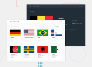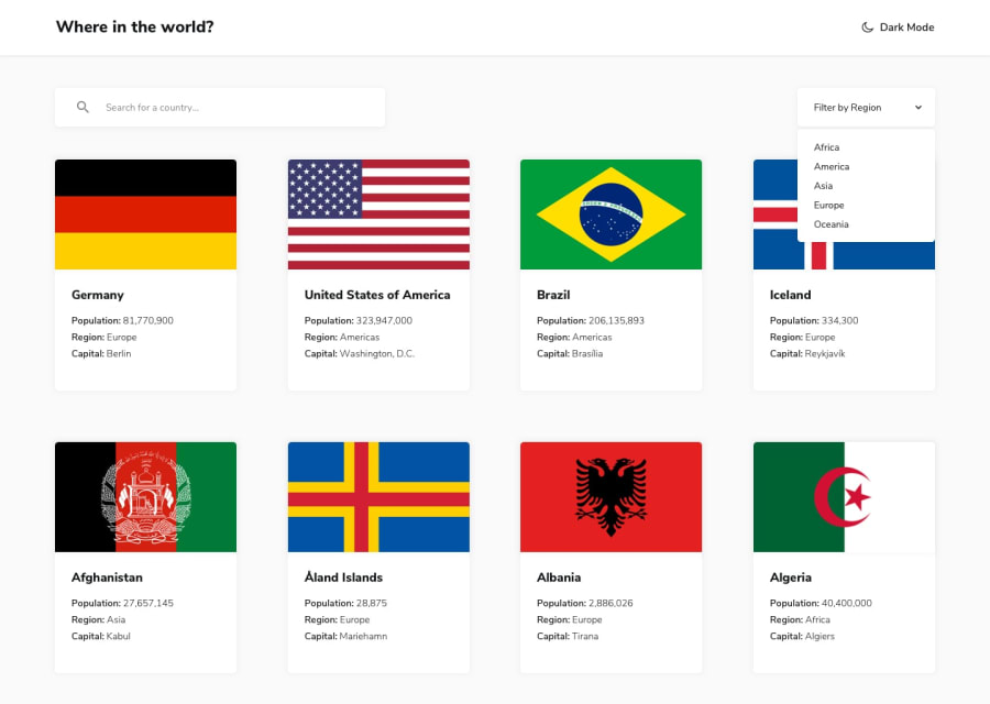
Submitted over 2 years ago
REST Countries API with color theme switcher solution
@vinit-churi
Design comparison
SolutionDesign
Solution retrospective
any feedback on how to structure JavaScript code better would be helpful.
Community feedback
- @denieldenPosted over 2 years ago
Hi Vinit, good job! I took some time to look at your code and have some ideas for improving it:
- add more descriptive text in the
altattribute of the image - if you write the
widthattribute in theimgelement you don't have to specify thepxsize, just the number - remove all unnecessary code, the less you write the better as well as being clearer: for example the
divcontainer of image imgelement must have analtattribute in the details page, it's very important!- to make it look as close to the design as possible add to
contain-all-detailsclass:
display: flex; flex-direction: row; gap: 5rem; flex-wrap: wrap;- instead of using
pxtry to use relative units of measurement -> read here - I don't understand why you have inserted all those
data-attributes in thedivof the cards of the countries in the home - instead of using
innerHTMLusetextContentbecause it is more secure - I would also add a query reset button, I find it very convenient
- to make all flag images the same height use the
object-fit: cover and aspect-ratio: 3/2property
Overall you did well 😉
Hope this help and happy coding!
Marked as helpful0 - add more descriptive text in the
Please log in to post a comment
Log in with GitHubJoin our Discord community
Join thousands of Frontend Mentor community members taking the challenges, sharing resources, helping each other, and chatting about all things front-end!
Join our Discord
