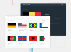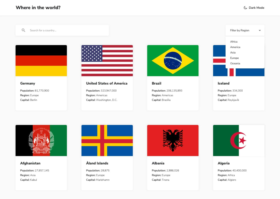
Design comparison
Solution retrospective
Any feedback will be appreciated!
Community feedback
- @isaacnovaesPosted about 3 years ago
Hey man!
Nice job! It looks nice and is responsive. However, I have two suggestions:
-
When you select a country that has many neighboring countries, like Brazil or Germany, their neighboring countries list overflows the screen horizontally for screen widths bigger than 900px. So check it out
-
You could implement a media query for tablets, because from a screen width of 600px to 1000px, the countries flag takes up the majority of the screen, and the countries data looks tiny. So implementing this media query would improve UX
Marked as helpful0@TechieStephenPosted about 3 years ago@Isaac-Novaes okay thanks so much will work on that.. I think it's because I majorly targeted smartphones and desktops. But I will also include tablets like you suggested.
0 -
Please log in to post a comment
Log in with GitHubJoin our Discord community
Join thousands of Frontend Mentor community members taking the challenges, sharing resources, helping each other, and chatting about all things front-end!
Join our Discord
