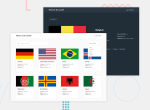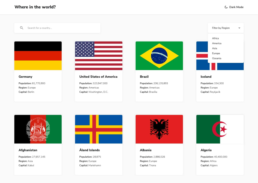
Design comparison
Community feedback
- @yishak621Posted almost 2 years ago
Good design but u didn't design a night mode toggler and border country button in the single country page
0@victoribironkePosted almost 2 years ago@yishak621 I decided not to do the night mode as it was optional in the style guide. The border countries the API returned were in the short form and the design requested the full country name so I wasn't sure how to do it.
0@yishak621Posted almost 2 years ago@vdiqbd o sure u r right ...u can fetch the data again using the shortnames in another endpoint url
https://restcountries.com/v3.1/alpha?codes=BRA,GER,ENGeg . BRA GER...it will grab that country data so from that specific data u can extract the common name and display it example//fetching datas using codes endpoint const codes = borders .map((border) => { return border; }) .join(','); const newurl = `https://restcountries.com/v3.1/alpha?codes=${codes}`; const borderCountries = await fetchAllData(newurl); const newHTML = await borderCountries .map((border) => { return `<button class="btn">${border.name.common}</button>`; }) .join(''); borderCountry.innerHTML = newHTML;0
Please log in to post a comment
Log in with GitHubJoin our Discord community
Join thousands of Frontend Mentor community members taking the challenges, sharing resources, helping each other, and chatting about all things front-end!
Join our Discord
