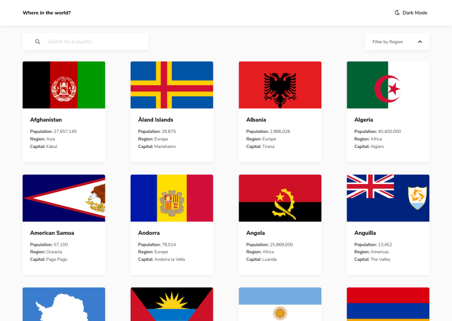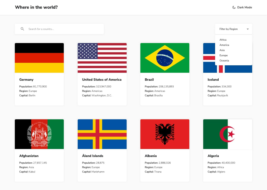
Design comparison
Solution retrospective
Any feedback is welcome 😃
Community feedback
- @grace-snowPosted about 4 years ago
Sorry, I wouldn't say this is 100% perfect. It looks awesome but I can't interact with anything except the search because it's not keyboard or assistive tech accessible at the moment. It would be amazing if you went through it and added native interactive elements to fix all that 👍
2@georitPosted about 4 years ago@grace-snow thanks for the feedback. It’s one of my goals this year to learn more about accessibility and to implement it into my work.
0@grace-snowPosted about 4 years ago@georit just using semantic interactive elements instead of divs would get you 90% there, go for it. Good luck with your goal 💯
0 - @JoshAnabaPosted over 4 years ago
This is what we call finished implementation, great work! :)
0 - @DRACKSBOYVEVOPosted over 4 years ago
I think it is an incredible idea, the colors, the details, great work, I congratulate you!
0
Please log in to post a comment
Log in with GitHubJoin our Discord community
Join thousands of Frontend Mentor community members taking the challenges, sharing resources, helping each other, and chatting about all things front-end!
Join our Discord
