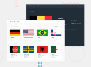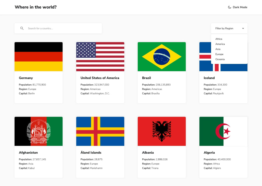
Design comparison
SolutionDesign
Community feedback
- @Nnadivictory25Posted almost 2 years ago
Hey man , just went through your project and there are some things I will like to point that might be helpful
- First, the background color you used for the card should be the one for the body and vice versa
- Your borders links on details page should have same padding so they can take same size instead of clustering . The container of the buttons should also have a flex display with wrap to avoid overflowing which really spoilt your layout.
0
Please log in to post a comment
Log in with GitHubJoin our Discord community
Join thousands of Frontend Mentor community members taking the challenges, sharing resources, helping each other, and chatting about all things front-end!
Join our Discord
