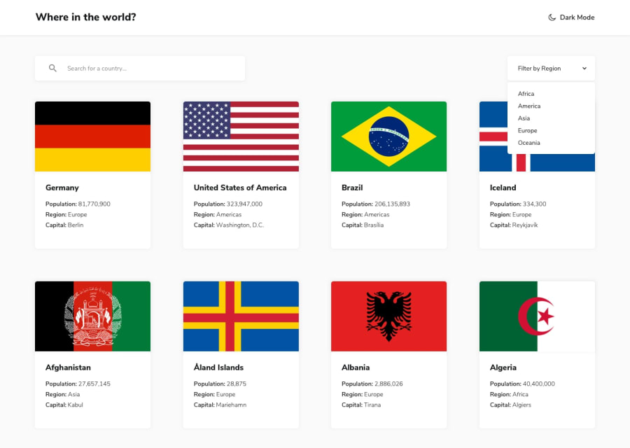
Design comparison
SolutionDesign
Solution retrospective
Pretty happy with my solution, although I think the css could be simplified.
One weird bug I noticed: When opening the page in safari on iphone, the border-radius of the search bar is buggy when toggling the dark/light mode. I couldn't figure out why that is.
For general improvement I think a pagination for the countries on the homepage would be nice. And after being on a country detail page and going back to the home page, the scroll height of the visited country could be restored. Any tips on how to implement this?
Community feedback
Please log in to post a comment
Log in with GitHubJoin our Discord community
Join thousands of Frontend Mentor community members taking the challenges, sharing resources, helping each other, and chatting about all things front-end!
Join our Discord
