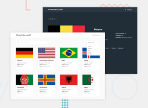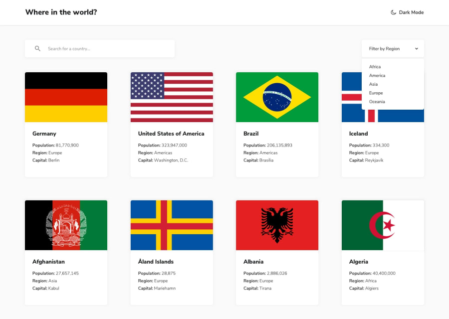
Design comparison
Solution retrospective
Easier than expected. Implementing the theme switcher was surprisingly painless. Not sure how accessible this is though. I'll see what the report says and go from there.
Community feedback
- @lukaasz555Posted almost 2 years ago
Well done Dylan!
I like the way you've made dark mode and how you used flexbox. I think you can improve some UX details, like:
-
dropped down menu, I think there would be a better idea to use <a> or <button> instead of <div> (clickable items) and so more, it's a little bit confusing that there is a cursor pointer but when I click the dropdown is closing. User need to click precisely at the word, All, Americas etc.
-
handle state, when there is no country provided in input, e.g. I typed Englang and I can't see nothing there:D
-
I think you could use more semantic marks instead of divs, e.g. you could use button inside filter container, 'cuz it's a clickable html element or you could replace div.countries-container by <main>;
-
another good feature is make a clickable header, but it's just idea:)
Marked as helpful1 -
Please log in to post a comment
Log in with GitHubJoin our Discord community
Join thousands of Frontend Mentor community members taking the challenges, sharing resources, helping each other, and chatting about all things front-end!
Join our Discord
