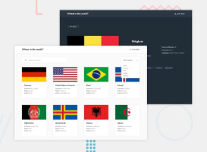
Rest Countries API ,Vite, React and tailwind css , with theme switch
Design comparison
Solution retrospective
Any feedback or criticism is welcome.
Community feedback
- @petritnurediniPosted 10 months ago
Congratulations on completing your React project! It's great to see your hard work and effort. Here are a few suggestions to further enhance your project:
-
Error Handling and User Feedback:
- Implement error handling in your API calls. For instance, in
CountryDetail, handle errors gracefully and inform the user if there's an issue fetching data. This improves user experience. You can learn more about error handling in React from Error Handling in React 16.
- Implement error handling in your API calls. For instance, in
-
Optimizing Performance:
- Consider using
React.memooruseMemoto prevent unnecessary re-renders, especially in components likeCountryDatawhere you are processing data. It's essential for larger applications. Check out React.memo for Functional Components Rendering Control.
- Consider using
-
Code Structuring and Readability:
- It's good practice to split large components into smaller, reusable ones. This not only makes your code more readable but also easier to maintain. For example, in
CountryData, you could create separate components for displaying country details and border countries. Learn more about component composition in React here.
- It's good practice to split large components into smaller, reusable ones. This not only makes your code more readable but also easier to maintain. For example, in
Keep up the excellent work! Remember, every project you complete brings new learning opportunities and experiences. Stay curious and keep exploring the vast world of React! 🌟🚀
Marked as helpful1 -
- @alex931dPosted 10 months ago
hello FAZEEN IJAZ great project overall but i notice quite a few mistakes something you must have notice
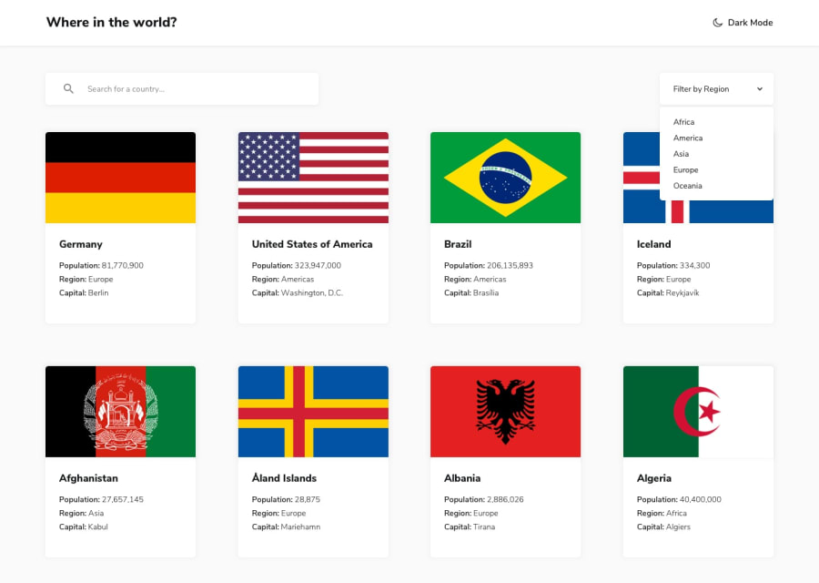
- the dropdown menu when its active the menu is not aligned with the dropdown select and is far down the screen 2.on larger screens it would be nice to have an limit for the maximum amount of cards showen on the screen since there is far too many
- Population Decimal separator you can achive this using Regular expressions
- change of dark mode label to light mode when changing
- website crashing when rendering Antarctica i had same problem since antarcica has no borders and no offical language and currency
next time building a larger project i reccoment you to test your website and build a finish product
Marked as helpful1@RazaAbbas62Posted 10 months agoThanks bro for your time that you check my site and provided those useful suggestions. Thanks a lot.@alex931d I will keep in mind those suggestions next time I build a project.
Enjoy Coding :)
Thanks again
0 - @theYuunPosted 10 months ago
Alexander did mention the filter by region alignment issue, but I also found that if you move your mouse straight down from the button to the dropdown list, you pass over the flag below the button and you hover over that flag, thereby also placing that flag over the dropdown list. Consider using z-index liberally, like
z-index: 9999;, to avoid such issues in the future.Also allow your app to treat a dropdown like a modal, ensuring that other interactive elements do not steal focus from targeted elements. A cool way to do this is by adding a transparent div with a lower z-index below the dropdown that spans the screen and blocks mouse interactivity with anything lower down the z-order. A great alternative to using this input-blocking div is playing around with the
event.stopPropagation();function available to Javascript.Otherwise, amazing work!
Marked as helpful0@RazaAbbas62Posted 10 months agoThanks for the time to write down those suggestions, I will keep in mind while building future projects. @theYuun
0
Please log in to post a comment
Log in with GitHubJoin our Discord community
Join thousands of Frontend Mentor community members taking the challenges, sharing resources, helping each other, and chatting about all things front-end!
Join our Discord
