REST Countries API Using Vue 3 + Composition API
Design comparison
Solution retrospective
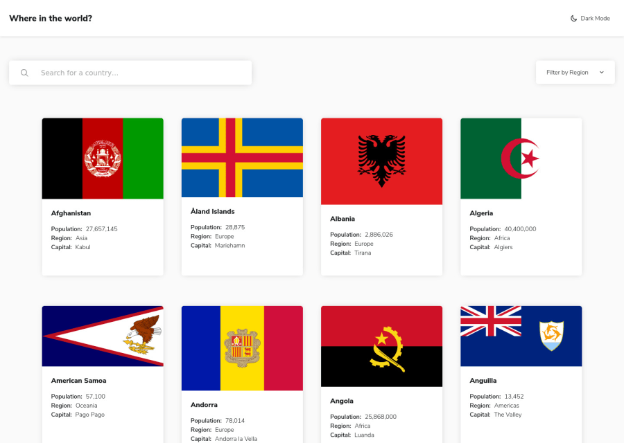
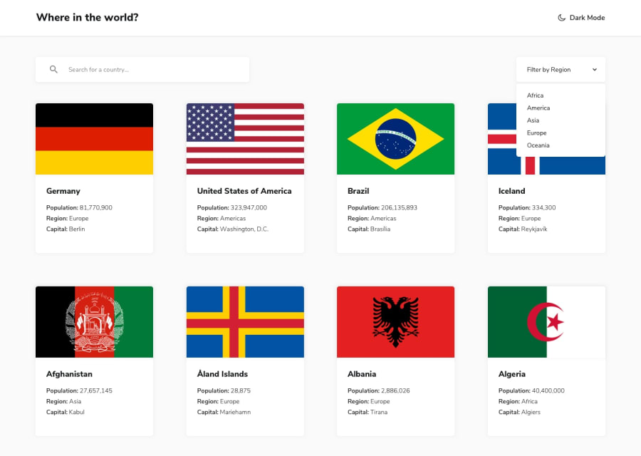
This was a fun challenge and I decided to use Vue 3 for the first time (I've used Vue 2 up until now). With the new Composition API I was able to make a native data "store" much like Vue 2's Vuex. I also took my first crack at using Grid layouts for the country details pages.
- Since some countries' names are so long, I set a
text-overflowvalue along withoverflow: hiddenin the CSS so the button sizes wouldn't be all over the place. Thetitleattribute has the full text, but I'm wondering if this is okay from an accessibility standpoint. Any suggestions would be appreciated. - I wanted to make the whole country "cards" clickable; however, it doesn't work if you click on a blank area of the card. If you know how to make it so the entire card is clickable, I would love some feedback?
- I'm not happy with how I ended up dealing with the loading of border countries since I couldn't get the reactivity to work while the
Countrycomponent is active. Instead, I am switching to theLoadercomponent until the extra country's details are loaded and then switching back. I'd like to just reactively switch between the countries while in theCountrycomponent, but I kept gettingundefinederrors because I couldn't get the computed property to run for that. If you have any suggestions, I'd like to hear them.
If you have any feedback/comments, particularly with how I handled the Composition API of Vue 3. Of course, other comments on other aspects would be great too!
Community feedback
- @Da-vi-dePosted over 3 years ago
Hi Nisenihonjin, it looks great and it's full responsive, i tried it on Chrome and Firefox. Sorry i can't write about the code as i don't know anything about Vue. Well done! Keep up with the good work.
0@aaron-romanickPosted over 3 years ago@Da-vi-de Thank you for your positive feedback. Even if you don’t know Vue, getting feedback from you about the user experience can still be really helpful!
0 - @ChamuMutezvaPosted over 3 years ago
You managed to pull and display the data but what you need to work on is the responsive nature of the site. The site and the images in general are not responsive, a challenge of a lower level will be better for practice purposes
0@aaron-romanickPosted over 3 years ago@ChamuMutezva Thank you for your feedback! I'm always looking for better ways to improve. However, I'm a little bit unclear by what you mean by "responsive".
- Do you mean that the website layout isn't responsive based on your viewing device (ie: smart phone, tablet, desktop).
- Do you mean that the website doesn't respond to appropriately to user input (eg: incorrect results appearing on the screen based on search criteria).
- Is the website just slow in general (eg: images slow to load)?
If you could elaborate, that would be so helpful!
0@ChamuMutezvaPosted over 3 years ago@nisenihonjin, looks like it is more to do with my device. My apologies, but I can send you a screenshot(on slack) of how it is appearing on my mobile. I tried another mobile device and it looks pretty good
0@aaron-romanickPosted over 3 years ago@ChamuMutezva Yes, if you could send me a screenshot via Slack of the offending device (as well as the specs, if possible), I'll see if I can figure out why it's displaying incorrectly.
0@aaron-romanickPosted over 3 years ago@ChamuMutezva It’s “@Aaron R” (without quotes)
0
Please log in to post a comment
Log in with GitHubJoin our Discord community
Join thousands of Frontend Mentor community members taking the challenges, sharing resources, helping each other, and chatting about all things front-end!
Join our Discord
