REST Countries API using Vite, React, Tailwind
Design comparison
Solution retrospective
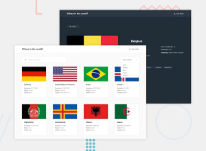
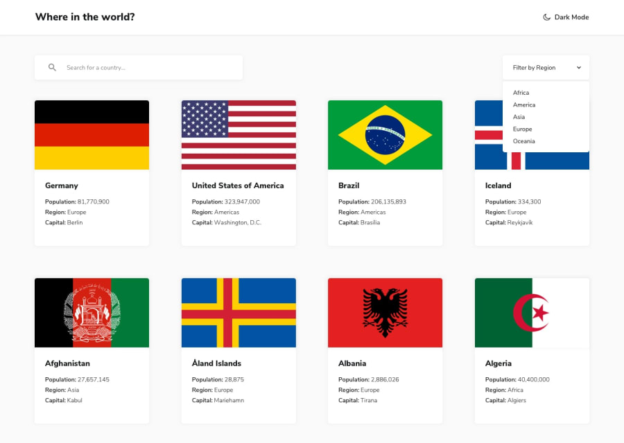
I've made this project to be slightly differ from the given design. One of the noticable changes is that in the original design, the flags are supposed to be shown fully in the card from edge to edge. But in my web, there are a wrapper for the country flags. This is done to respect each flag's aspect ratio, and to make it differ from another country's flag if there are countries with similar flags like Indonesia and Monaco.
But most importantly, i'm proud to have finished this project to deepen my knowledge in API calls, using React hooks, especially useContext, and routing using React-router. I've also learned how to filter and implement search bar in this project
What specific areas of your project would you like help with?I'm open to any critics and advice. Thank you
Community feedback
- @amjadsh97Posted 4 months ago
good job! I suggested to add those rules to the img tag for flag. img { width: 100%; height: 100%; object-fit: cover; }
1@RDifaultPosted 4 months ago@amjadsh97 Thanks for the advice, didn't we know could maintain the aspect ratio with object-fit: cover. Will try to implement it
0
Please log in to post a comment
Log in with GitHubJoin our Discord community
Join thousands of Frontend Mentor community members taking the challenges, sharing resources, helping each other, and chatting about all things front-end!
Join our Discord
