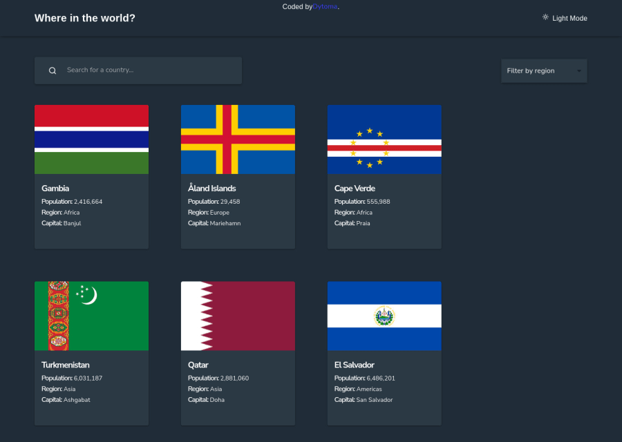
Rest countries api using vite + react, material UI and framer motion
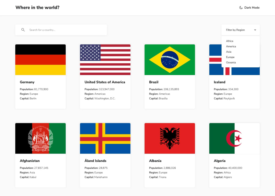
Design comparison
Solution retrospective
Hey guys👋👋👋
Here is another solution🎉🎉🎊.
I'm finally done with this challenge, I had a lot of bugs that I had to fixed and it took me sometime to realize my mistakes. Overall, I learned a lot from this project, for instance the Object.values method. I used material UI for this project and it comes with a lot of components ready to use but for customization, it's a little difficult as you have to use inline styles. Vite is an amazing tool for running your apps faster, I definitely recommend it.
I'll appreciate to have your feedback on this app and leave some comments if you find the animations cool.
Happy Coding🙌
Community feedback
- @0xabdulkhaliqPosted about 2 years ago
Hello there 👋. Congratulations on successfully completing the challenge! 🎉
- I have some recommendations regarding your code that I believe will be of great interest to you.
HTML 🏷️:
- This solution generates accessibility error reports due to
non-semanticmarkup, which confueses landmark for a webpage
- So fix it by replacing the
<div id="root">with semantic element<main>in yourindex.htmlfile to improve accessibility and organization of your page.
- What is meant by landmark ?, They used to define major sections of your page instead of relying on generic elements like
<div>or<span>
- They convey the structure of your page. For example, the
<main>element should include all content directly related to the page's main idea, so there should only be one per page
BUTTONS 🔴:
- This solution has also generated accessibility error reports due to lack discernible text for
<button>element
- The
<button>must have discernible text that clearly describes the destination, purpose, function, or action for screen reader users.
- Screen reader users are not able to discern the purpose of elements with role="link", role="button", or role="menuitem" that do not have an accessible name.
- The
<button>name rule has five markup patterns that pass test criteria:
<button id="al" aria-label="Name"></button> <button id="alb" aria-labelledby="labeldiv"></button> <div id="labeldiv">Button label</div> <button id="combo" aria-label="Aria Name">Name</button> <button id="buttonTitle" title="Title"></button>-
Ensure that each
<button>element and elements withrole="button"have one of the following characteristics:- Inner text that is discernible to screen reader users.
- Non-empty
aria-labelattribute. aria-labelledbypointing to element with text which is discernible to screen reader users.role="presentation"orrole="none"(ARIA 1.1) and is not in tab order (tabindex="-1").
LINKS 📍:
- The WCAG says that you should not describe the image text in this situation but the link function.
- When an
imageis the only content of a link, the text alternative for the image describes the unique function of the link.
- or adding the description after (note that using
aria-describedbythe description might be hidden)
<a href="about.html" aria-describedby="about page">About</a>
- Summary, add a
aria-describedbyto<a>element to describe its purpose to screen readers and other accessibility devices
- EG:
aria-describedby="Someone's facebook profile"
I hope you find this helpful 😄 Above all, the solution you submitted is great !
Happy coding!
Marked as helpful1@DytomaPosted about 2 years ago@0xAbdulKhalid Thank you for your feedback, I was so focused on the layout that I missed all these things. I'll implement it to my code.🙌
0
Please log in to post a comment
Log in with GitHubJoin our Discord community
Join thousands of Frontend Mentor community members taking the challenges, sharing resources, helping each other, and chatting about all things front-end!
Join our Discord
