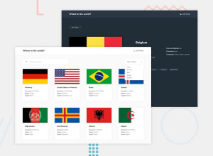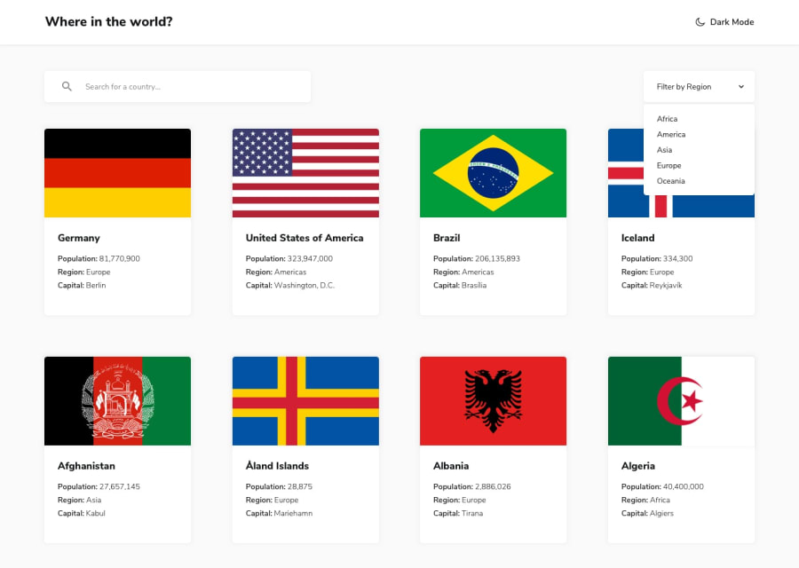
Design comparison
Solution retrospective
This one took forever but I finally did it! Next time though I think i could definitely make some of my solutions a bit cleaner/more efficient (some of the ways i fetched data were kind of "hacky")
What challenges did you encounter, and how did you overcome them?The hardest part was definitely getting the buttons for bordering countries in the detail view (ended up taking the "borders" attribute of the main country and fetching each country using those values).
Community feedback
- @TedJenklerPosted 3 months ago
Hi Eric,
I wanted to say that I really like your project! The hover effect you implemented looks great and adds a nice touch. However, I have a few suggestions that could help enhance the overall user experience:
Grid Layout: You might want to explore working with CSS Grid, especially for projects like this. Advanced grid techniques can help make the layout smoother and more responsive across different devices.
CSS Details:
Height and Background: Consider refining the CSS for element heights to ensure consistency. On the Indonesia card, adding a 50% opacity border might give it a more polished look. Similarly, all cards could benefit from a subtle border or card divider.
Border Names: I appreciate that you've paid attention to the border names—many overlook this detail. However, aligning them to the left could prevent them from jumping around on the screen when swapping countries, making the interface more stable.
Custom Select: Your custom select component is well done! To make it even better, you could add a hover effect and consider positioning it on the right side of the screen, as that's where most users tend to look first.
Bug with Search: I noticed a bug when searching for a country like Sweden. The height of all elements varies, which disrupts the layout. Applying a min-height or max-height to the image or card could help maintain a consistent look.
React Code Structure: Your React code structure is impressive and clean, making it easy to follow. One suggestion for improvement would be to separate your API and fetch logic into a custom hook. Placing it in a dedicated hook folder would enhance modularity and make bug fixing easier. As it stands, it's not immediately clear where your fetch logic is located.
I hope this feedback helps you refine your project even further and that it was helpful. Keep up the great work—you’re definitely on the right track!
Best regards, Teodor
Marked as helpful1
Please log in to post a comment
Log in with GitHubJoin our Discord community
Join thousands of Frontend Mentor community members taking the challenges, sharing resources, helping each other, and chatting about all things front-end!
Join our Discord
