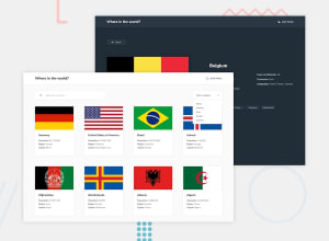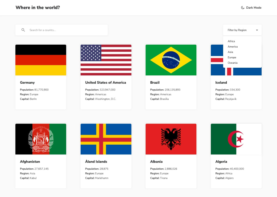
Design comparison
Solution retrospective
This challenge was tricky especially with the responsive because the images don't have the same size so I tried some workarounds to solve this issue and make it looks good. Also, it's a PWA which means its installable and works even in offline mode. Feedback is much appreciated 😊🤓
Community feedback
- @shubhamthedevPosted over 4 years ago
Hey, good job on the project here are a few things maybe you could fix:
-
The borders on the details page are supposed to take you to that page, basically they are supposed to be links.
-
Okay there are way to many html and accessibility issues maybe fix those.
I did the same project using react, you can check it out here.
Hope this helps.
0 -
Please log in to post a comment
Log in with GitHubJoin our Discord community
Join thousands of Frontend Mentor community members taking the challenges, sharing resources, helping each other, and chatting about all things front-end!
Join our Discord
