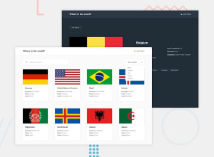
Design comparison
Community feedback
- @DruxAMBPosted about 1 year ago
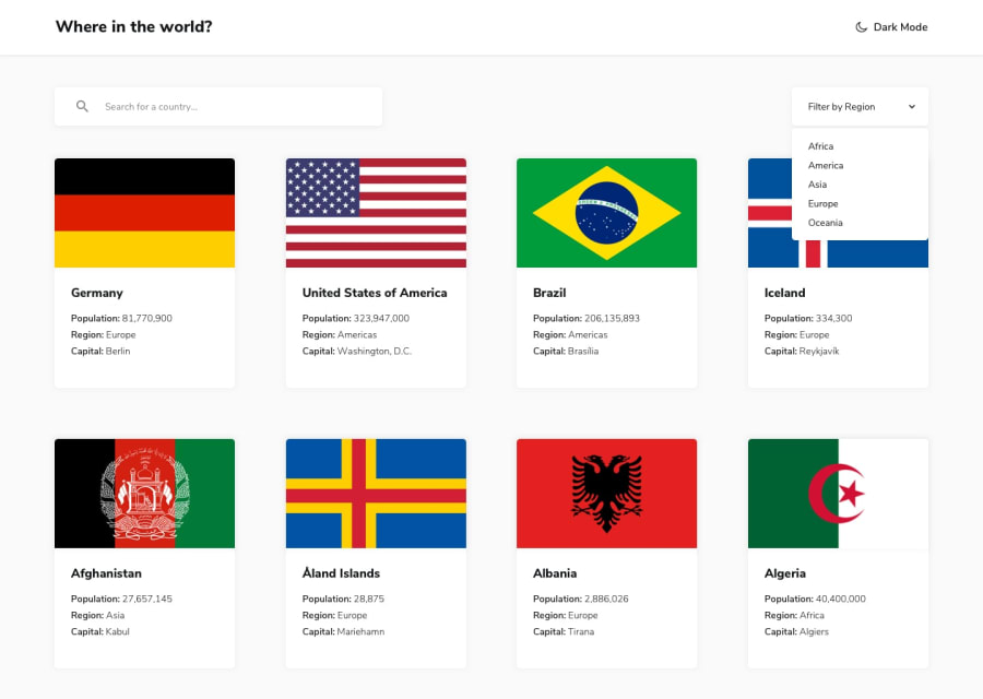
Well done man, you did really well on the project. You need to change the styling of the card items so that it will display 4 countries on each column as shown in the default design. Here is a reference from my project.
<div className="grid lg:grid-cols-4 md:grid-cols-3 sm:grid-cols-2"> {filterApi.map((mapping) =>{ const {numericCode, flags, name, population, region, capital} = mapping; return ( <div key={numericCode} className="card overflow-hidden w-64 rounded-lg shadow-lg hover:shadow-xl mb-10 cursor-pointer m-auto"> <img src={flags.png} className="w-64 h-36" alt="DruxAMB png" /> <div className="p-3 mt-2 mb-5"> <div className="font-black text-md my-2 text-start">{name.common}</div> <div className="flex text-sm font-semibold">Population: <p className="font-extralight ml-1">{population }</p></div> <div className="flex text-sm font-semibold">Region: <p className="font-extralight ml-1">{region}</p></div> <div className="flex text-sm font-semibold">Capital: <p className="font-extralight ml-1">{capital}</p></div> </div> </div>Using something like this will help you
<div className="grid lg:grid-cols-4 md:grid-cols-3 sm:grid-cols-2">Hope this was helpful*?
Happy Coding!!: DruxAMB
0@ecaleb97Posted about 1 year ago@DruxAMB Thank you so much for your feedback Muhammad. I really appreciate it. I'll try to improve my design. Happy Coding!! Caleb 👍
0
Please log in to post a comment
Log in with GitHubJoin our Discord community
Join thousands of Frontend Mentor community members taking the challenges, sharing resources, helping each other, and chatting about all things front-end!
Join our Discord
