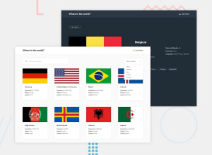
REST Countries API solution, React, React Router, Styled Components
Design comparison
Solution retrospective
Initially I thought the challenge will be quite easy despite being tagged as advanced. But getting the React Router to work properly for each country sub page and particularly to make it so that by clicking on any of the bordering countries takes you to that country sub page, ended up being more difficult than I expected. Additionally I did not realize that custom styling a select field will be as complicated as it ended up being.
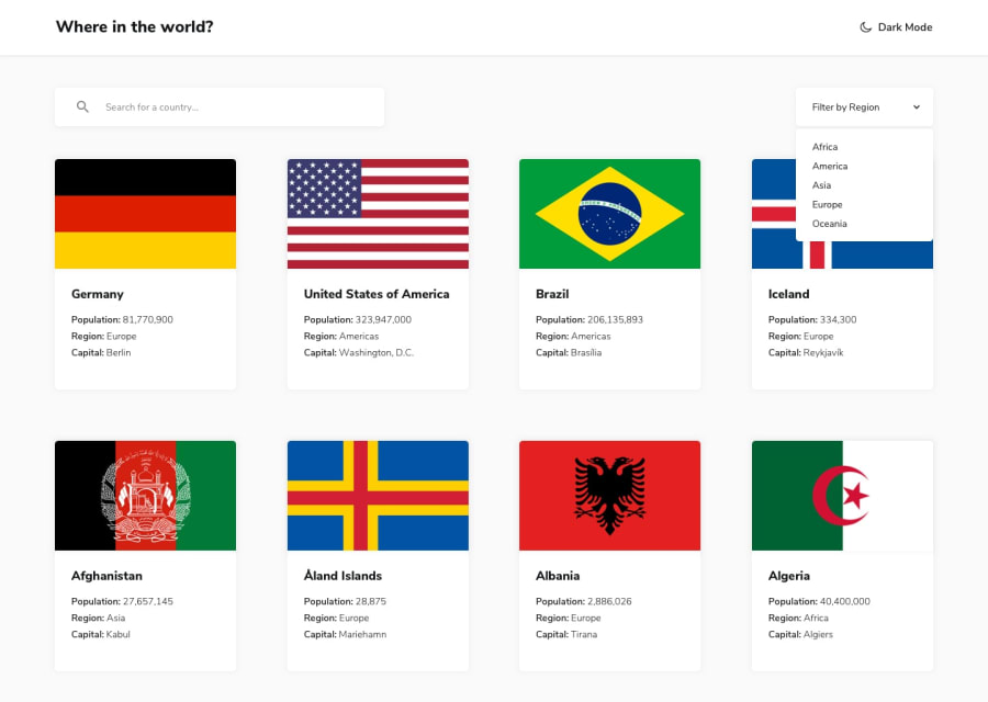
I have a question regarding the country flag images on the root page. Not all images are the same size so sometimes, some flags end up having white empty space and don't fit in the div properly. I somewhat fixed this issue by using object-fit: cover CSS property, but this makes some of the flags look weird. I was looking for better solutions, but couldn't find anything on my own. If someone could point me in the direction of how I could solve this problem in a better way, I would appreciate it.
Additionally if anyone would take the time to go over some of my code and could give me some feedback on my code quality I would be grateful.
Thank you for your answers in advance.
Community feedback
- @thesohailjafriPosted over 3 years ago
First of all great work on Rest Countries🙌,
You can fix that image white space issue by using 'object-fit: cover' in CSS. Just define the width and height of image-div or img-tag and set object-fit to cover so that the image takes the whole div space.
0@kpav33Posted over 3 years ago@thesohailjafri thank you for you feedback.
I tried to implement your suggestion, but my issue still persists. I already have object-fit: cover set on image as its property, which causes some of the flags to not show nicely in their entirety. This is particularly noticeable on some of the flags. If you check out the flag of Belarus you will notice that it cuts off a sizeable piece of it and is therefore not accurate. This is the issue that I am still not certain how to solve.
1@thesohailjafriPosted over 3 years ago@kpav33
width: 260px; height: 160px;
these are my image size see if this helps.
0@kpav33Posted over 3 years ago@thesohailjafri,
this dimension do help with my problem, but unfortunately come flags are still not as nicely visible as I would like the to be. I think that the issue is with the fact that the country flag images are of different sizes and this is what is causing this problem.
Thanks for your help.
0@thesohailjafriPosted over 3 years ago@kpav33 yes some of the flags has different aspect ratio so that makes it difficult to have a component that fits all, you can try setting the height according to the flag size and adding extra space in component to compensate for that extra height.
hope it helps
1
Please log in to post a comment
Log in with GitHubJoin our Discord community
Join thousands of Frontend Mentor community members taking the challenges, sharing resources, helping each other, and chatting about all things front-end!
Join our Discord
