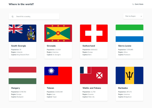
REST Countries API Solution

Solution retrospective
This is my solution for the REST Countries API application. I am a free user, and do not have access to the design files from the Pro version. I built this app using React, Next.js, TailwindCSS, React Hook Forms, Axios, and Next Themes.
Technologies Used:
- React
- React Hook Forms
- Next.js
- TailwindCSS
- Next Theme
I am most proud of the display and interactions that I added to the project. It feels snappy and responsive!
What challenges did you encounter, and how did you overcome them?My initial struggle was getting the search and region filter working as expected. Once I settled on an approach, I was able to accomplish that relatively quickly.
What specific areas of your project would you like help with?I had trouble implementing the filters and using their respective API endpoints. I think the best way to manage that would be setting up a Context Provider and Reducer. Does anyone have a good resource for this approach?
Please log in to post a comment
Log in with GitHubCommunity feedback
No feedback yet. Be the first to give feedback on Sean Hoang HIll's solution.
Join our Discord community
Join thousands of Frontend Mentor community members taking the challenges, sharing resources, helping each other, and chatting about all things front-end!
Join our Discord