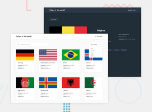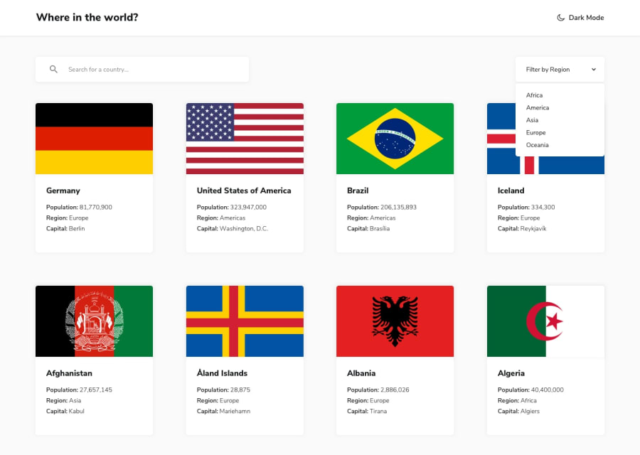
Design comparison
Solution retrospective
This challenge was exciting to do, it had a lot of things to be done and threw some curve balls.
I feel like this is my best solution so far, I like how I structured my React code and this was my first time using any thing other than css/scss. Using Styled components for this project was definitely a breath of fresh air and I couldn't be happier.
Somethings were a little hard to implement, like getting the full border names since the api only returns country codes, but after a little bit of tinkering I managed to get it done, and I also added a loading animation on first load. I will have to say the hardest thing for this challenge was definitely achieving responsiveness and making it not look weird at the same time.
Thanks for checking out my solution, and if you have any feedback please feel free.
Community feedback
Please log in to post a comment
Log in with GitHubJoin our Discord community
Join thousands of Frontend Mentor community members taking the challenges, sharing resources, helping each other, and chatting about all things front-end!
Join our Discord
