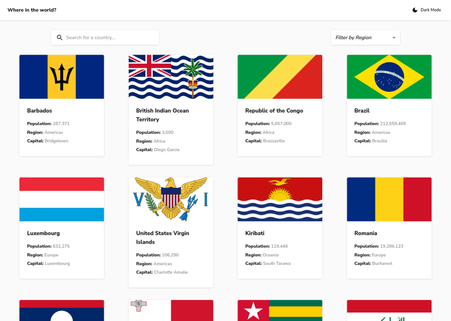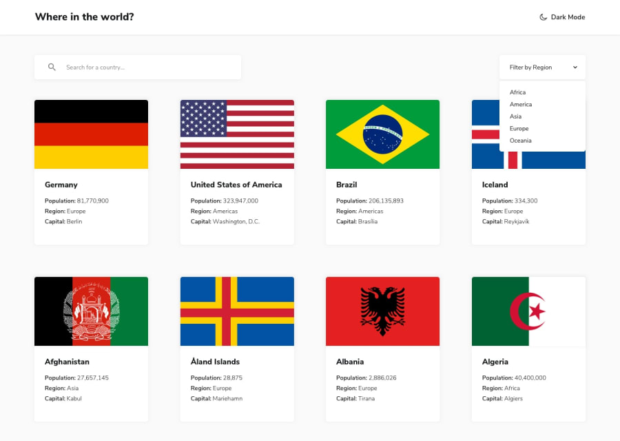
Design comparison
Solution retrospective
Hi. Please, don't pass by. I need your advice! Any advice on where I can improve. And how much do I need to improve to get hired? Thank you for your opinion
Community feedback
- @wendyhamelPosted about 2 years ago
Hi there, very nice try, but there is still room for improvements.
You could look at the accessibility report. It can improve your use of semantic HTML. The HTML validation report can be useful too but can show errors related to React in your case.
You should check your console while working on this project. There is a lot showing up, errors and logs, the console should remain clean when the site works as it should.
The site crashes when you search some country that is not found with a filtered region (intentionally entered a non-existing one here, just random letters like ‘dfgwxemr’).
These are some major things you should take care of.
Some more minor things:
- You should give the search input a type of
searchinstead oftext - Time of the animation fade in of the flag when you pick a single country is a bit long if you ask me
- Hover effect on dark/light mode the edges come too close to the text and icon, makes it feel cramped
- As mentioned by @avinasdv the position of trailing grid items. Another possible solution is to switch flex for grid.
- Align the search input and the filter with the edges of the country cards on the largest size
Hope this will help you improve!
Happy coding!
Marked as helpful1 - You should give the search input a type of
- @AdrianoEscarabotePosted about 2 years ago
Hi Danny, how are you?
I really liked the result of your project, but I have some tips that I think you will enjoy:
- every Html document must contain the main tag, so we can identify the main content, to fix this, wrap all the content with the main tag. HTML5 landmark elements are used to improve navigation experience on your site for users of assistive technology.
- To improve the accessibility of the project you could have put an h1. Every page must contain a level 1 header, for people who use screen readers, identity what the main title is.
The rest is great!
I hope it helps... 👍
1 - @avinashdvPosted about 2 years ago
Hi, The project is very nice with respect to UI. I haven't gone through code, but one UIchange I could suggest is that: The last row contains only two countries, because justify-content:space-between is used that worked well if the row contains 4 countries, but with 2 or 3 countries there is a lot of space in between the countries and mis-alignment of columns.
I would suggest to utilize 1 or 2:
1
- justify-content: flex-start;
- /* justify-content: space-between; */
- column-gap: 50px;
2 :last-child pseudo element to take care of the last row with css
Note: with (1) the column-gap might not be supported in all browsers and you can check it from https://caniuse.com/ and take the decision to provide support for cross-browser compatibility.
I hope this helps, Happy Coding.
1
Please log in to post a comment
Log in with GitHubJoin our Discord community
Join thousands of Frontend Mentor community members taking the challenges, sharing resources, helping each other, and chatting about all things front-end!
Join our Discord
