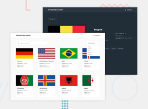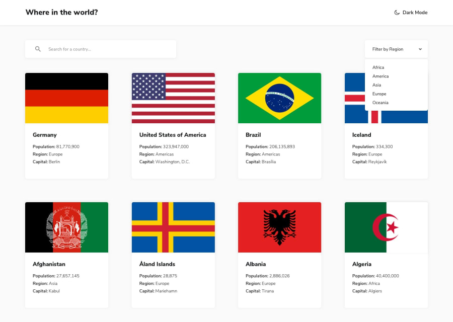
REST Countries API (React/react-select/Dark Theme/Responsive UI)
Design comparison
Solution retrospective
- Customizing the CSS of
react-selectcomponents was very tedious - Still learning better ways to use @media tags / determining viewport to serve the appropriate CSS (maybe styled-components will be a better avenue than 1:1 CSS file for each Component).
- Always looking for feedback on best practices! e.g. CSS layout, ContextProvider, React Component design.
Community feedback
- @adeleke5140Posted almost 3 years ago
Great project.
A couple issues I noticed from the live preview are:
- The theme text doesn't switch, it stays as dark mode.
- the fading that occurs is a bit too slow. I know you were going for a smooth transition but I believe that can be improved.
You mentioned using React-select, how about trying out the native HTML select form control?
Marked as helpful1@cbserraPosted almost 3 years ago@adeleke5140 Thank you for the feedback!
- Is this on the main page listing the countries where the theme text doesn't switch for you? I see it switches for me (macOS, Chrome), but I did create a
* { transition: .5s }css property -- I see it lags a bit, so I should maybe look into targeting elements and transition properties. Also, I wonder if rendering all 200+ countries at once is slowing the UI up, too. I'm going to look into pagination. - Also discussed in bullet point 1 :) .
The native HTML select form control -- I'm using
react-selectfor both the 'Country Search' input as well as the 'Filter Region' -- are you saying just use native<select>for the region filtering? Saying thereact-selectmay be a bit too heavy?0@adeleke5140Posted almost 3 years ago@cbserra Hi Chris, Yes, it's the main page, even after switching to dark mode, the text still says "dark mode" instead of "light mode".
The transition is excellent, but a bit slow.
Regarding
react-select, it's a nifty library but sometimes native HTMLselectelements hooked up with event handlers and callbacks can be sufficient for your needs1@cbserraPosted almost 3 years ago@adeleke5140 ohhhh. That text. I guess it was intentional. I was hoping the solid moon would act as the toggle for “true”, but maybe I should change the text as well.
1
Please log in to post a comment
Log in with GitHubJoin our Discord community
Join thousands of Frontend Mentor community members taking the challenges, sharing resources, helping each other, and chatting about all things front-end!
Join our Discord
