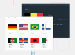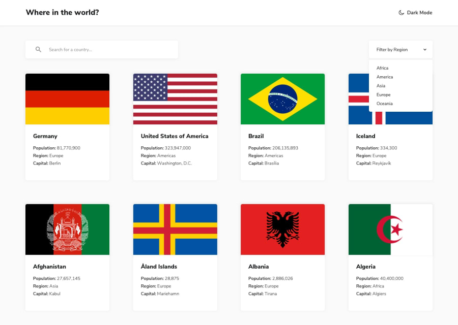
Design comparison
SolutionDesign
Community feedback
- @mcwachiraPosted over 2 years ago
I liked how you implemented the application bu there some details I feel you can improve on . When toggoling between the light and dark mode can you alos make the text and the icons change to showcase the different modes as it only showing the dark mode text and icon.
Marked as helpful1@lavitzwindPosted over 2 years ago@mcwachira Thank u for your feedback, I'll take it into account.
0
Please log in to post a comment
Log in with GitHubJoin our Discord community
Join thousands of Frontend Mentor community members taking the challenges, sharing resources, helping each other, and chatting about all things front-end!
Join our Discord
