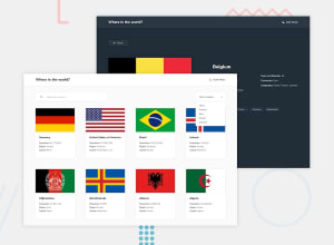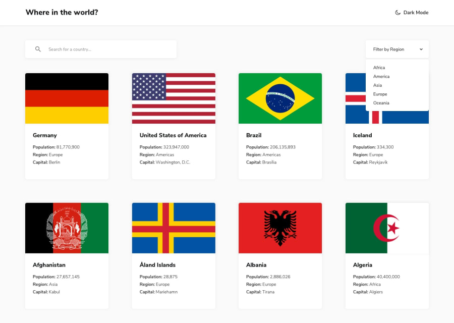
Design comparison
Solution retrospective
Hi everyone, I did this with Vanilla JS and I think using a framework to do this would be better because my js code looks like a spaghetti 🥲
I'd really like to get thoughts and feedback on this one 👍🏾
Community feedback
- @legion40216Posted over 2 years ago
Good work i did mine on Vanilla js too :D the loading screen seems to get annoying after every click.
there seems to be a little responsive problem specially on the (class= "seleted") because every image seem to have different sizes and height they often overflow out of the container
i see some of the problem was created by (class= "text") why did u opt to create the structure using grid ? simple flex box should have worked perfectly as well
1 - @acha-jrPosted over 2 years ago
Thanks for the feedback, I've updated and I hope it's better
0
Please log in to post a comment
Log in with GitHubJoin our Discord community
Join thousands of Frontend Mentor community members taking the challenges, sharing resources, helping each other, and chatting about all things front-end!
Join our Discord
