REST Countries API (Next.js & Server Actions + TypeScript + Tailwind)
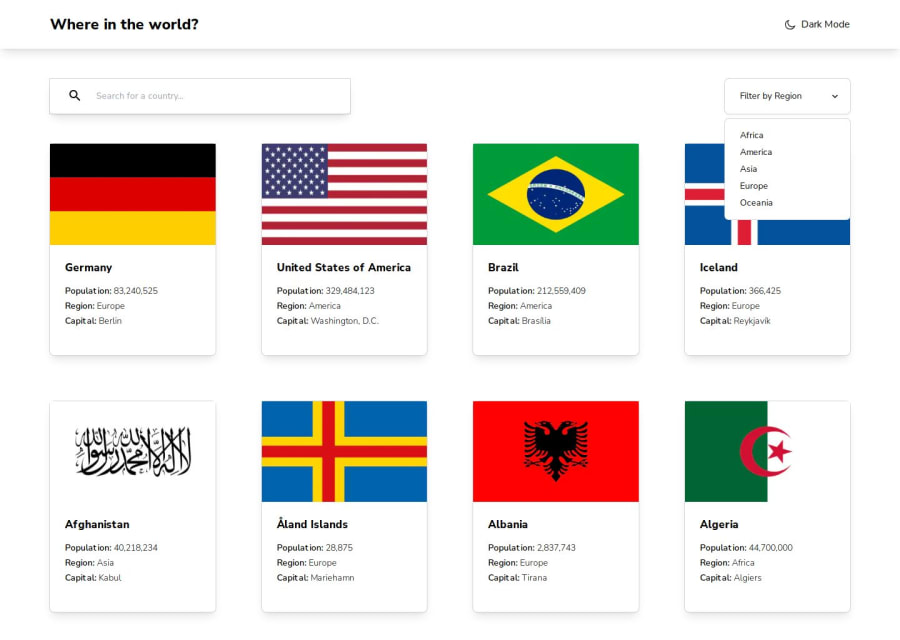
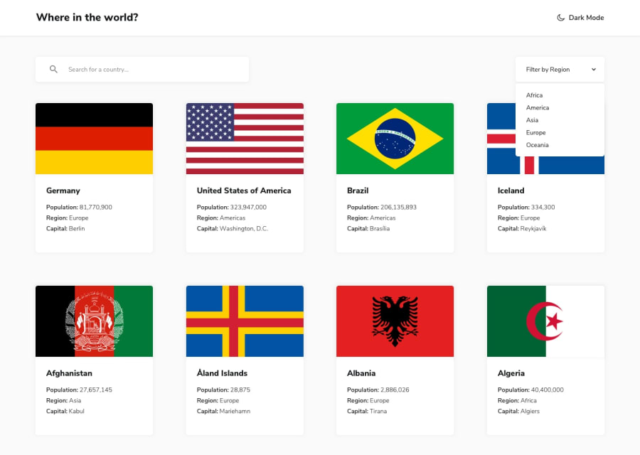
Design comparison
Solution retrospective
🎁 Features:
- Next.js Server Actions to fetch data with:
- Filtering 📂
- Pagination ♻️
- Sorting 🔍
- Achieved +95% in Lighthouse score for performance, accessibility, best practices, and SEO. 📊
- Resemblance with the original design. 🎨
- Small animations with Framer motion. 🎬
- No errors or warnings using ESLint (Airbnb style guide). ✔️
- Custom hooks. 🎣
- Utilized TailwindCSS for responsive styling. 🎨
- Codebase is well-maintained and formatted using Prettier. 💻
🛠️ Built With:
- Next.js 14. ⚡
- TypeScript 🚀
- TailwindCSS. 🎨
- ESLint (Airbnb style guide). 📦
- Framer-motion. 🎬
- npm - prettier - prettier-plugin-tailwindcss. 💻
🔍 Clarifications:
- While the Rest Countries API was an option, it had limitations like lack of pagination and limited filtering capabilities. I opted to utilize Server Actions in Next.js and the data.json provided with the challenge. This allowed seamless integration with MongoDB for efficient data handling.
- I acknowledge that continuous polling for change requests might consume more data, but it was implemented for experimental purposes.
Any suggestions on how I can enhance this solution or achieve even better performance are welcome!
Thank you. 😊✌️
Community feedback
- @DudeldupsPosted about 1 year ago
Hello! 👋🏻
I know you've been active for a long time on here, but I just wanted to say that this is a challenge tackled by many users that should not yet be doing it and I'm not lying: You are the first person I see that keeps the aspect ratio of the flags so they're not cut off on the sites 😅
I also like the animations when you select another region from the dropdown (the cards gradually move to their "new" position). How does that work exactly with Framer Motion?
One or two small things I saw: "Where in the world?" is kind of an inappropriate h1 heading. It doesn't really describe the site.
Your text input is missing a label.
Your toggle button for the dark mode is not accessible. Best practice would be to use an
aria-pressedstate on it. Screen readers would then pronounce it like this: "Activate dark mode, toggle button, pressed" if it's active.The icon does not change when the button is clicked.
On the detail page of the countries, you set the countrie's name as an h1, but you already have an h1 in the title.
Overall very nice solution 👌🏻
Marked as helpful1@MelvinAguilarPosted about 1 year ago@Dudeldups
Thank you so much for such detailed feedback and for taking the time to review my solution.
About the animation, I used the
<AnimatePresence>element to animate each card when they disappear. Then, I wrapped each card in a motion component (<motion.div>) and assigned it a "key" prop. Framer Motion handles detecting any changes in the list and animates the movement accordingly using the key prop. You can find a more detailed example in their documentation: https://www.framer.com/motion/animate-presence/#propsI appreciate your feedback once again.I've just pushed some updates to my repository to fix those issues. Thanks for helping me improve!
0 - @alex931dPosted about 1 year ago
Hello, nice solution! However, I have noticed quite a few issues, noting they are not major:
The pagination drop-down goes outside of the screen. When changing to dark mode, the moon icon should also change. On the example with Antarctica, there is blank space instead of saying "No currencies," "No borders," or "No capital." I noticed around the 800px mark, some containers on the home page don't have the same size. Around the mark of 765px on a /country page, the flags don't seem to be centered. Other than that, great job overall!
Marked as helpful0@MelvinAguilarPosted about 1 year ago@alex931d Beautiful feedback. Thank you so much for paying attention and taking the time to point out the errors. This solution is a bit outdated, and I don't always catch these things 😅. I'll fix it as soon as possible. Again, thank you very much.
Update: Fixed problems
0 - @ZukizukPosted 12 months ago
Hello 👋. Your solution looks amazing, as always.
I am done with this project but I was wondering how to sort the initial fetch result to match that of the design. Can you please tell me the criteria you are using for the sort ?
1 - @JunbolPosted 10 months ago
Hola Melvin, solo una nota: Tu link para code pen en tu perfil esta roto. Saludes
Junier
0 - P@SabaMarghania1Posted 10 months ago
Wow, That's amazing. how did you develop your coding skills?
0 - @HenryLima07Posted 12 months ago
Nice coding! I recommend you to use PerfectPixel next time
0
Please log in to post a comment
Log in with GitHubJoin our Discord community
Join thousands of Frontend Mentor community members taking the challenges, sharing resources, helping each other, and chatting about all things front-end!
Join our Discord
