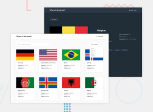
REST Countries API | LocalStorage | Theme Switch | Vanilla JS | SCSS
Design comparison
Solution retrospective
Hi Devs! 😎
It has been a while since I published a new challenge. I have been learning JavaScript full-time and I just completed an internship program (I was the frontend team-lead 😎).
This challenge was very fun to execute. The challenge helped me master how to effectively consume API.
Kindly explore my solution and leave a feedback!
Community feedback
- @JohnBroersPosted about 3 years ago
Nice work Folarin! Nice addition of the hover animation on the country blocks. A couple remarks and improvements from my side:
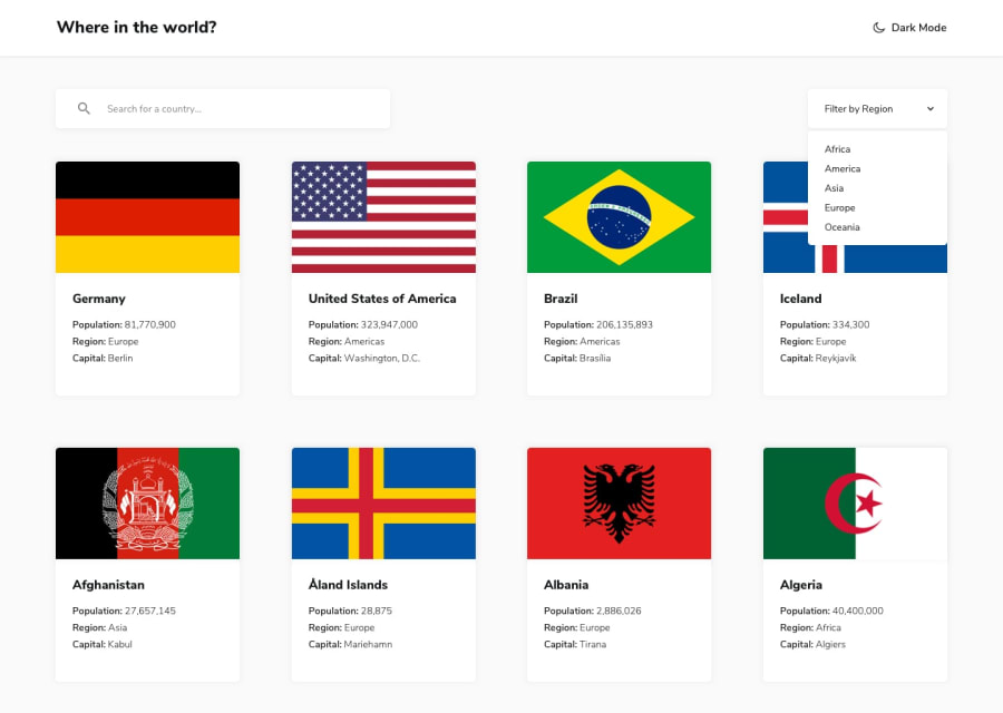
- The country blocks in the overview feel a little bit messy because of the different heights and sizes:
- I would suggest setting a suitable fixed height on the flag images.
- Make the flex items 'align-self: stretch' so all items in a row are equal height.
-
I feel like the font-family is different then the design. Maybe that's design choice of your own. But be sure to set a font-family on the input and select elements because those ones are using the default browser font right now.
-
Try to add thousand separators to the population numbers to make them more readable. (So 27,657,145 instead of 27657145)
-
The country detail page keeps showing a loading spinner at the bottom. Even though i feel like everything has been loaded.
-
I noticed a lot of console.logs when i used the search function. You might wanna remove that when you clean up your code.
Your javascript code looks really well structured, nice job!
Marked as helpful1@folathecoderPosted about 3 years ago@JohnBroers Thank you very much! I appreciate the feedback!
0
Please log in to post a comment
Log in with GitHubJoin our Discord community
Join thousands of Frontend Mentor community members taking the challenges, sharing resources, helping each other, and chatting about all things front-end!
Join our Discord
