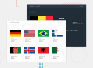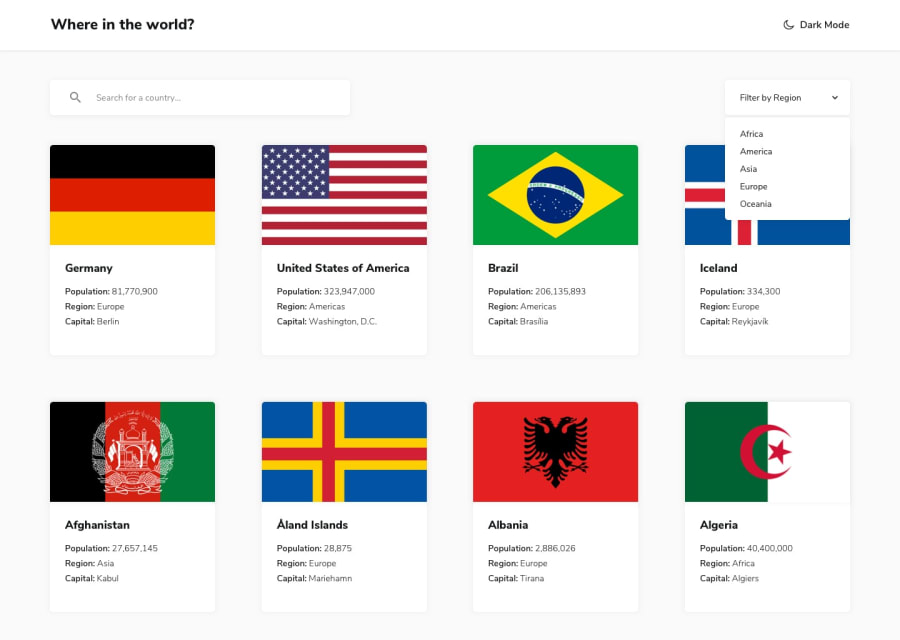
Design comparison
Solution retrospective
Last challenge from Frontend Mentor. It was really difficult. It is still a bit glitchy, it looks like the first time you're loading the page you could not display countries details, but after refreshing it seems to be working properly...
Anyway thanks a lot Frontend Mentor for giving us the opportunity to create so many projects, I really feel like I improved since I began, and many thanks to the community for the kind comments and help.
I guess I'll now learn how are SASS and React working. Have a great day everybody 🤗
Edit : Added night mode, thank you @Palgramming for helping me being less lazy
Community feedback
- @palgrammingPosted over 3 years ago
Everything you have so far looks and works great you just do not have the Light mode Dark Mode theme options but that should not be hard to add since everything else looks good
1@pierre-pellegrinoPosted over 3 years ago@palgramming I was too lazy to develop it but I'm definitely going to make it 😀 Thanks a lot Patrick !
0@pierre-pellegrinoPosted over 3 years ago@palgramming Dark mode theme : done ! 🤗
0@palgrammingPosted over 3 years ago@PierreWagon Congrats great that you got that done the only thing maybe in dark mode you should change the color of the half moon to the same color at the dark mode text
But Great Job 🌟🌟🌟🌟🌟
1@pierre-pellegrinoPosted over 3 years ago@palgramming Good idea, will do ! Thanks again !
0
Please log in to post a comment
Log in with GitHubJoin our Discord community
Join thousands of Frontend Mentor community members taking the challenges, sharing resources, helping each other, and chatting about all things front-end!
Join our Discord
