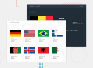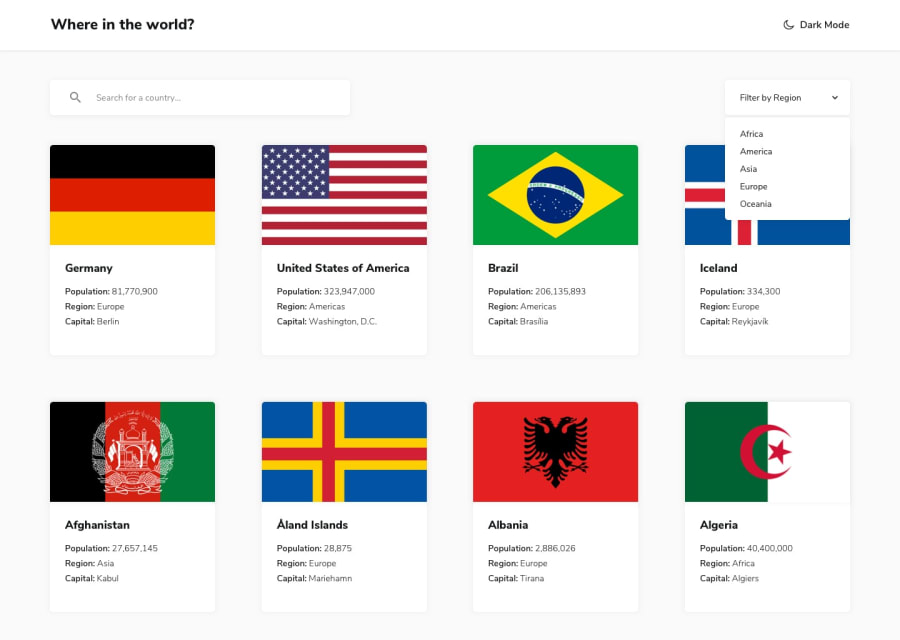
Design comparison
Solution retrospective
hello best community , i really enjoy in this challenge . please some advice to enhence my code . thank you
Community feedback
- @NaveenGumastePosted almost 3 years ago
Hay ! Good Job you made it look nearly perfect to the preview
These below mentioned tricks will help you remove any Accessibility Issues
-> Add Main tag after body like it should be your container
-> For 1st heading or h1 tag, use header tag and then inside the header put your h1 or h2 etc
-> But use header tag only once in main heading element.
-> Always use h1 first and then h2, h3 and so on
Keep up the good work!
Marked as helpful1@adityas24Posted almost 3 years ago@Crazimonk Lol you are spamming here. Almost same comment on every solution.
Marked as helpful1@NaveenGumastePosted almost 3 years ago@adityas24 that is becoz all are having same Accessibility Issues i am just helping them
Sry to borther you if you don't want my help
0
Please log in to post a comment
Log in with GitHubJoin our Discord community
Join thousands of Frontend Mentor community members taking the challenges, sharing resources, helping each other, and chatting about all things front-end!
Join our Discord
